

I updated sections of this article in April 2023 with new research
How We Got Here
Touch screens in cars are not new. In fact, the first production car fitted with a touch screen was the 1986 Buick Riviera.
The CRT touch display was not that bad, but it took some decades before touch screens were good enough to be widely adopted in cars. After Tesla launched the Model S with its 17” touch screen, carmakers have been eager to design increasingly bigger touch screens. Today, it is an exception if a car is not fitted with one. There are many reasons why this is happening. To dive into those, we first have to define the different types of interactions that occur while driving and how they evolved.
Classifying the Interactions
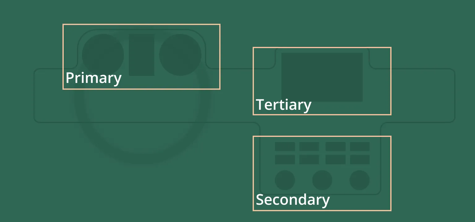
Aside from the essential driving controls, like steering and braking, I divide the interactions into three groups. The first set is the primary interactions. They include all the functions that are directly related to driving and safety. Examples are monitoring the speed, turning on the indicators, and operating the windscreen wipers.
The secondary interactions are actions that occur frequently but take only a short time to accomplish. These can be changing the music volume, changing the cabin temperature, or turning on the air conditioning.
The tertiary interactions are the opposite of the secondary ones. They are infrequent but are more complex and take longer to accomplish. Examples are filling in a destination in the navigation system or changing personal settings in the car.
The Evolution of the Interactions
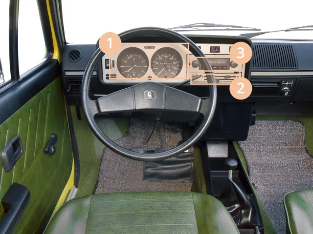
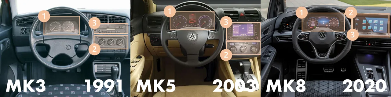
Over time, these sets of interactions have evolved in mostly the same way. The interior of the Volkswagen Golf is an excellent demonstrator. The first-generation Volkswagen Golf has a simple interior. The primary actions are limited to two gauges, some buttons, and a stalk for the indicators. The same goes for the secondary settings, consisting of three sliders to control the temperature and some volume controls. The only tertiary interaction is to find and set a radio channel.
Over the years, you can clearly see the impact of technological progress on the interactions. With each generation, more features are added to the interior.
All three sets of interactions increase in quantity, even the primary ones. In the Golf, for example, instead of some basic gauges and controls, the latest generation’s primary interactions now also include adaptive cruise control, speed limit warnings, and a range of other safety systems. Even something as simple as turning on the windscreen wipers or lights has increased in complexity with different modes, sensors, and settings.
Similarly, the secondary controls include many more different ways to set the right cabin temperature. There are buttons for heated seats and windows, air conditioning, individual climate control, and more.
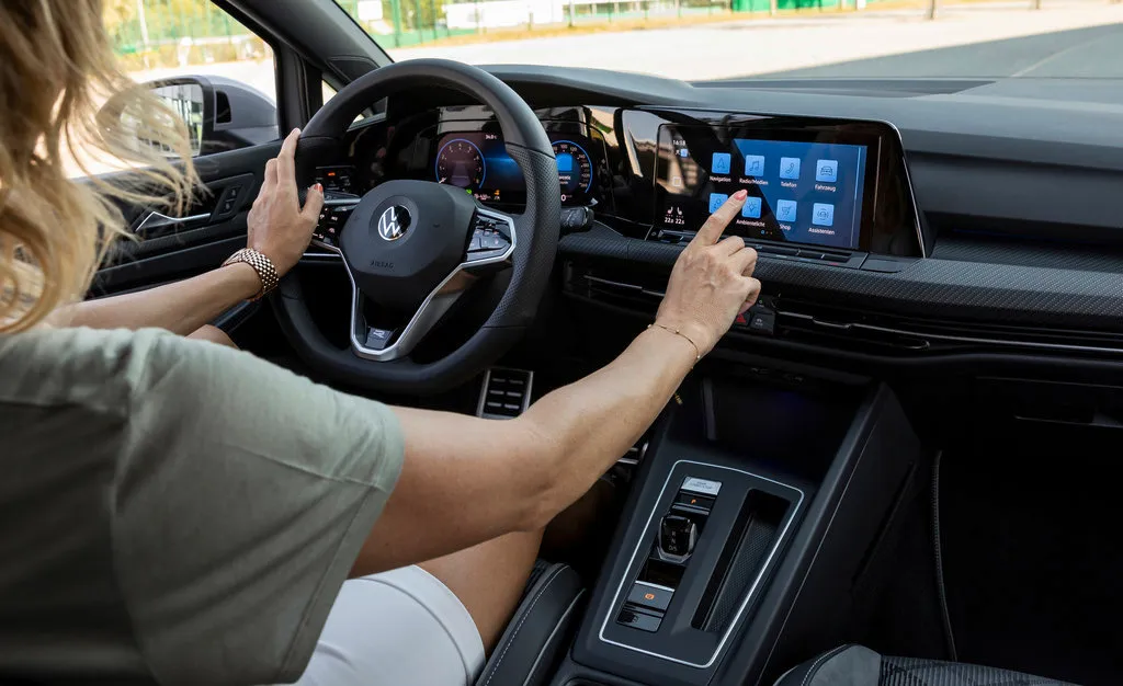
But the real visible change is an exponential increase in tertiary interactions. Whereas in the first generation Golf, you can only choose a radio station, today there is an endless list of radio channels, streaming services, and podcast platforms. And that is just the media. Almost all cars come with navigation systems, phone connections, and internet-connected apps. All of these can be set up and configured to fit your personal taste. For example, you can choose the exact color of the interior lights, how heavy the steering should be, and which information should be shown in the cluster display.
Initially, all these interactions were controlled via indirect, physical controls. But over time, with each generation, the display grows in size, and the number of physical controls decreases.
The latest generation Golf is another important step because even the secondary interactions are not moved to the touch interface. The few physical buttons that remain are the ones that are legally required.
Why Choose Touch Screens?
Updated in April 2023
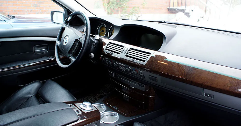
In 2001, BMW launched iDrive, one of the first in-vehicle infotainment systems. It was designed around indirect interactions via a controller close to the gear lever. At the time, it was a good balance between available technology, cost, and usability.
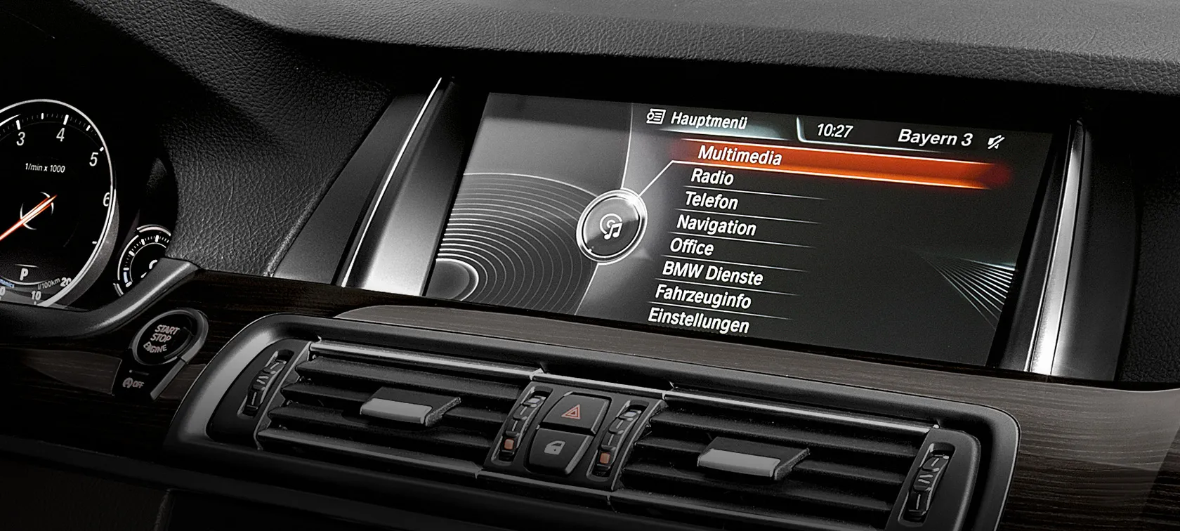
Over time, just like most in-car infotainment systems, BMW adjusted iDrive for use with touch interaction as well. Why did they decide to include touch interaction in the later version? A lot of it has to do with the increasing complexity of tertiary interactions. As the number and complexity of these interactions increase with each generation, touch controls outperform indirect controls like BMW’s early iDrive systems. There are a couple of reasons why.
Familiarity
Learning to use a new operating system is difficult, even more so while driving. It’s already difficult for tech nerds like me, so imagine how older, less tech-savvy users must struggle. Indirect input modes, like BMW’s iDrive controller, were rarely found outside of cars and thus, drivers couldn’t rely on mental models to learn the system. BMW tackled this by making the system as simple as possible, designed around two axes: moving up or down and left or right.
But as in-car systems become more complex, this becomes a limitation. For example, panning a map and selecting a location is cumbersome via an indirect controller. By relying on familiar interaction patterns, drivers can learn to use a touch interface quicker and perform more complex interactions. Moreover, in high-stress situations, drivers fall back on mental models to perform actions intuitively. This is why in CarPlay and Android Auto, developers have to stick to templates enforced by Apple and Google to ensure standardized interaction patterns.
Task completion time
By relying on mental models and without the movement restriction of indirect controllers, tertiary tasks are performed significantly faster via touch interactions when compared to indirect controls. Even compared to other possible interaction techniques like gesture interaction and voice interaction, touch interaction performs equally, if not better.
App ecosystem
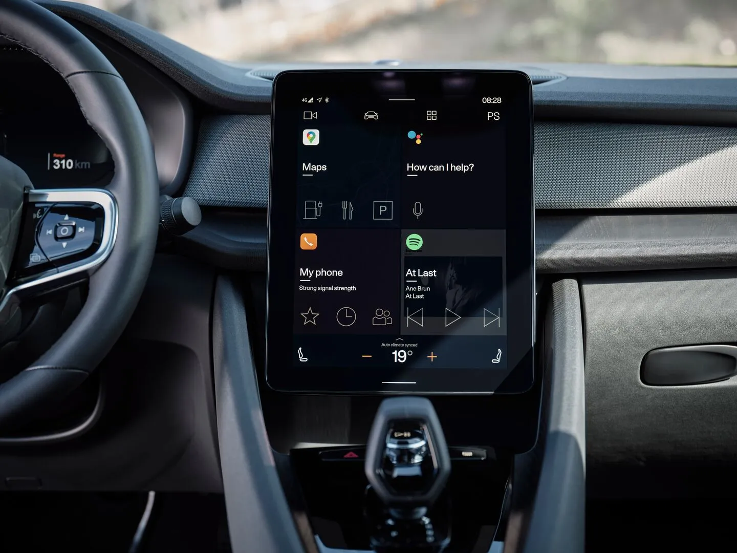
The reason why BMW could build iDrive completely around an indirect controller is that they owned the design of the entire system. Everything from the radio to the navigation system was designed by them. This was in a time before app stores. Today, we want to use our favorite cloud-based services like Spotify, Google Maps, and Audible. This means carmakers have to open up their system to third-party developers and give up some control over the design. These apps are all designed for touch screens. If they wanted to, carmakers could build a UI layer on top of these apps and design that for indirect input, but that would require some cooperation from third-party developers who will be unlikely to invest time into adapting their app for that.
Reduce phone distraction
So why go through the bother of offering third-party apps when they distract drivers anyway? Because otherwise, drivers will use their mobile phones which is worse. A study from 2016 showed that over 50% of accidents are caused by driver distraction. The second highest distraction category, after interacting with passengers, is cell phone usage. When a message notification comes in or a driver wants to listen to a specific playlist, and the barrier to doing this in the car is too high, they will pick up the phone. A phone UI is not designed to reduce distraction. Carmakers should offer these features but design them around reducing distraction, because using a phone is more dangerous. Apple CarPlay and Android Auto are great examples of how you can balance features that drivers want, with just the right limitations to reduce distraction.
Over-the-air updates
There are countless examples of cars with poorly designed physical interfaces, even leading to deathly accidents. Even though any design should be thoroughly tested before being released, mistakes will happen.
Having more digital controls gives carmakers the ability to perform over-the-air updates to fix and improve the design. Furthermore, digital design trends move much faster than interior design trends. By updating the visual design, cars can stay up-to-date longer. A big side note here is that there have been plenty of examples of carmakers moving essential features to a different place in UI updates that cause confusion. So over-the-air updates also enable carmakers to mess stuff up.
Disadvantages of Touch Screens
From a design perspective, touch screens may have more advantages than you think. But there are some serious trade-offs.
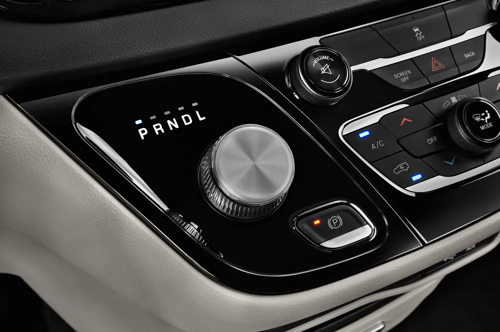
The most important one is visual attention. When interacting with a touch screen, drivers need to move their visual attention from the road to the screen to find the element they want to select. Furthermore, they have to coordinate their finger to that object without any tactile objects guiding it. When looking at the classification of interactions, it is clear that touch screens are therefore not suited for secondary interactions. Any interaction which occurs frequently and manipulates only one or two variables, like volume or fan speed, is best suited for an interaction mode that is permanently available and can be operated blindly.
The accident risk increases exponentially the longer a driver is looking away from the road. The guidelines from the NHTSA state that drivers shouldn't look away for longer than 2 seconds at 70MPH. Indirect controls perform much better at visual distraction than touch screens. Instead of having to focus continuously on a task, indirect controls allow the driver to glance at the display periodically while performing an interaction. This leads to longer task completion time, but much less visual distraction
Indirect input is the opposite of touch input, long task completion time but low visual distraction. A carmaker will have to weigh the and choose which one best fits their needs. In a lot of cases, that will be a touch screen, but they have to be optimized for drivers’ mental models and task completion time. The problem is that, currently, few in-car interfaces are and this is much to do with the design choices of car companies.
Design Choices of Car Companies
Designing a touch interface is difficult, especially in the context of driving. As task completion time is the most significant advantage of touch screens, you would expect it to be one of the main acceptance criteria. Yet, many car companies don’t seem to focus on that enough.
The perfect example of that is the latest trend of including secondary controls in the touch interface. For secondary interactions, the task completion time is already at a minimum with physical controls. On top of that, the physical controls require less visual attention. By moving those to a touch screen, both the task completion time and visual attention are compromised. It is not only annoying for end-users, but it is also dangerous.
Carmakers may do this because of decluttering and cost-saving. The aesthetics are important and may persuade customers to buy a car when they first see it. But good design is finding the right balance between ergonomics and aesthetics. When considering the dangers of driving, the first job of the designer should be to minimize distraction.
On top of that, the added benefit of prioritizing safety is that the controls will be more intuitive and easy to use. An interior will look super slick in the dealership if it has no physical buttons. Still, most buyers will find out very quickly after purchasing their car that it is annoying to have to divert visual attention to simply turn on the heater. In moving the secondary controls to a touch interface, the balance is leaning too much towards aesthetics than ergonomics.

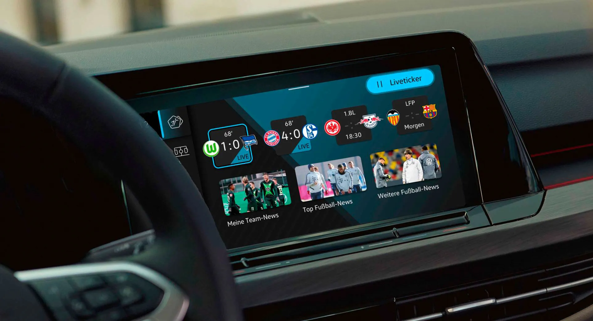
The second example of carmakers making suboptimal design decisions is the interface design itself, which is often needlessly complicated. They are filled with features that make you wonder why you would need them in a vehicle, like the possibility to check social media, order a pizza from the car, or find movie times.
To carmakers, offering a lot of features equals customer value. But as many tech companies have shown, customer value is actually created by ensuring users achieve their goals. Having too many features stands in the way of that, and research confirms that. Year after year, infotainment systems are the biggest frustration in new car ownership, and the majority of problems are design-related.
It may explain the popularity of Apple CarPlay and Android Auto. These systems are optimized for task completion time and restrict access to certain features and apps that are deemed too dangerous. As a result, they are less distracting than native infotainment systems.
Touch screens in cars receive a lot of public criticism. A lot of that is valid, but in this article, I wanted to bring more nuance to the discussion. Using a touch screen for secondary interactions is a bad idea. But for tertiary interactions, there is no perfect solution. Carmakers have to choose the least worst option and there is a great case to be made for touch screens. Most of the disadvantages come from the poor design choices of carmakers and not the interaction mode.
Get notified of new posts
Don't worry, I won't spam you with anything else