

Context
I typically split in-car interactions into two groups. There are quick and frequent actions like changing the volume or skipping a song. And there are long and infrequent actions. For example, filling in a destination in the navigation system or changing a media source. Today, most interactions happen via touch interfaces, which causes considerable frustration. Actually, most of the criticism concerns this first group of interactions.
Quick and frequent actions like skipping a song are often easier to use with physical controls than with touch interfaces. On a touch screen, there are no physical controls to reach out to blindly. Drivers have to use hand-eye coordination to aim for a touch button (which is usually too small). Doing this at 130 km/h on a bumpy highway is … not ideal. Before, a driver could grab onto a physical control, which requires much less hand-eye coordination.
It is easy to reject touch screens altogether based on this, but I think that is too simple. You can program touch screens as you want. There is no reason to stick to small touch buttons. There are ways to improve these quick interactions on touch screens without relying on these. I started looking for something with the same principles as physical controls. Namely, limited to no hand-eye coordination, high user satisfaction, and intuitiveness.
One possibility is swiping. You can make the interactive area for swiping big, much bigger than a touch button. It then requires much less hand-eye coordination. It is also a common interaction mode on touch interfaces, aiding intuitiveness.
Academic research
Several papers investigate swiping vs tapping for in-car interactions. They concluded the following. Swiping scores higher than tapping on driver distraction metrics like eyes-off-road time, lane excursions, or task completion time. There is one important side note, though. It only works if the swipe interaction uses pagination. For example, a swiping gesture should skip one song at a time rather than scrolling through the songs depending on the force of the gesture. The latter even performed significantly worse than tapping. I wanted to see the difference between tapping and swiping myself, so I created an experiment.
Experiment
My goal is to find out if swiping is less distracting and has higher satisfaction compared to tapping. To me, a perfect interaction is one where drivers don’t take their eyes off the road. Hence, the metrics I used are eyes-off-road time and task completion time. To measure user satisfaction, I used my own subjective description of my experience using both methods.
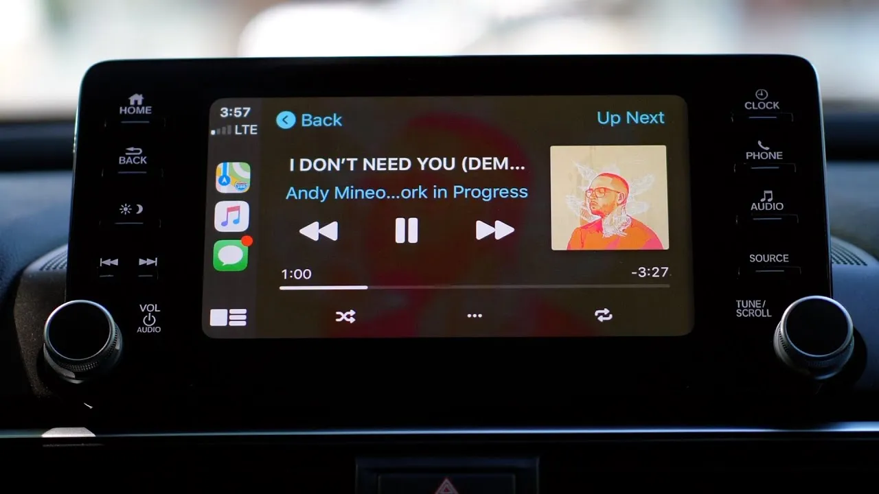
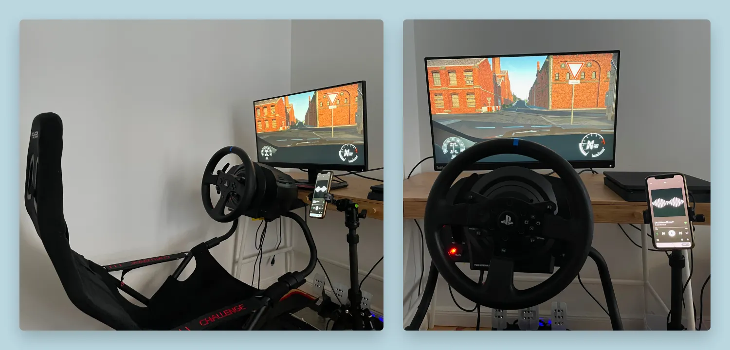
For safety and legal reasons, I obviously couldn’t test a prototype in my car while driving around the city. But I just got into sim racing, so I created my own amateurish driving simulator at home. As a media player, I used my phone running the Spotify app. Compared to an infotainment system, the display of my phone is smaller, but the actual surface of the media player is similar, or even bigger. The Spotify app also has the option to both tap a button, or swipe the surface area of the media player to skip a song.
I was interested in testing under normal, relaxed driving conditions. But also under stressful conditions. Imagine, for example, a scenario where you are driving in rush hour on a highway in the rain. It requires your full attention, so skipping a song should be possible with minimal distraction.
The question is, how can I most accurately simulate these scenarios? My best option was using the WRC 9 video game. It has an open test world where a player can freely drive around a fake city and countryside. This would be perfect to test normal driving conditions.
For the stressful condition, I could not think of anything requiring more concentration than doing a full rally stage. To complete it without crashing, you must stay in control of the car, scan the road ahead, and listen to the co-driver giving you instructions on upcoming turns. It takes up your entire visual and auditory resources. Losing concentration, even for a second, will result in your car being wrapped around a tree.
Test setup
For the normal scenario, my idea was to drive around the test area at a maximum of 80km/h for 5 minutes. During that time, I used my phone to skip songs. To measure the driver distraction metrics, I used my MacBook to film myself. I used one of my playlists on Spotify and turned off shuffle. Afterward, I matched the number of presses to the number of skipped songs, which showed any errors.
For the high-focused test, I chose a stage of the fastest, most notorious rally: Rally Finland. The setup was the same. But to simulate high cognitive load and stress, I tried to complete the stage in the fastest time possible while trying to skip as many songs as possible. I did two runs for each test case to reduce the influence of getting used to the stage and interaction.
Test alteration
After I completed one normal run with buttons and one with swiping, I added a third case. I suspected after these first tests that the deciding factor was the size of the interactive area and not the type of interaction. So I used Framer to create a simple prototype with huge buttons.
So my experiment went:
| Run | Scenario |
|---|---|
| 1 | Normal driving with tap |
| 2 | Normal driving with swipe |
| 3 | Normal driving with big buttons |
| 4 | High cognitive load driving without interaction |
| 5 | High cognitive load driving with buttons |
| 6 | High cognitive load driving with swipe |
| 7 | High cognitive load driving with big buttons |
| 8 | High cognitive load driving with buttons run 2 |
| 9 | High cognitive load driving with swipe run 2 |
| 10 | High cognitive load driving with big buttons run 2 |
Results
Normal driving
Driver distraction
The results for the normal driving scenario show a difference between normal buttons and the other two cases. It takes on average at least half a second longer to skip a song when tapping a small button, compared to swiping and large buttons. There is a minimal difference between swiping and large buttons.
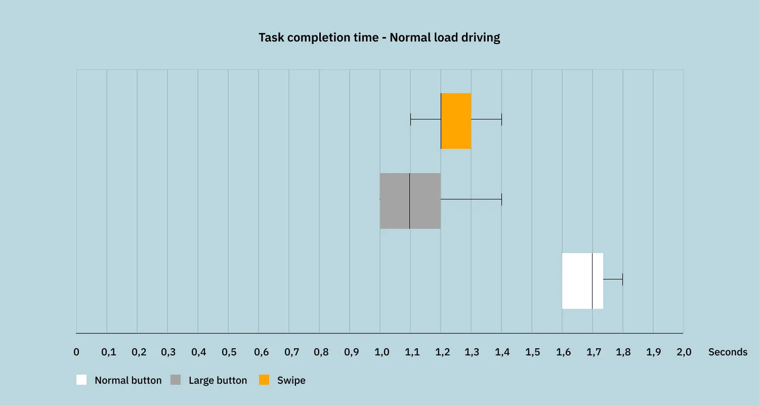
The eyes-off-road time produced similar results. There is a big difference between normal buttons and the other two. Again, there is almost no difference between big buttons and swipes.
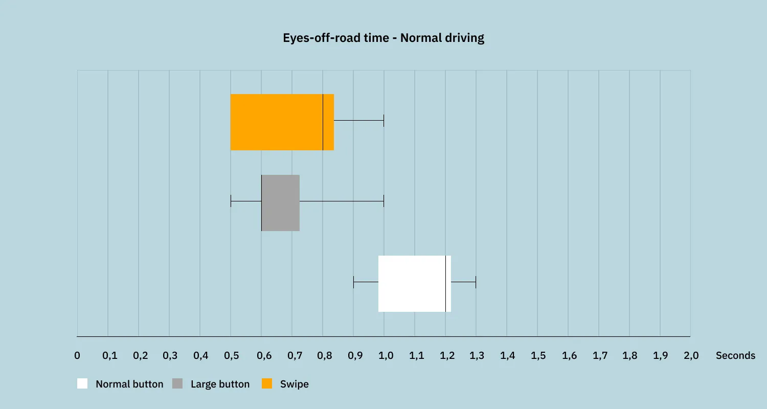
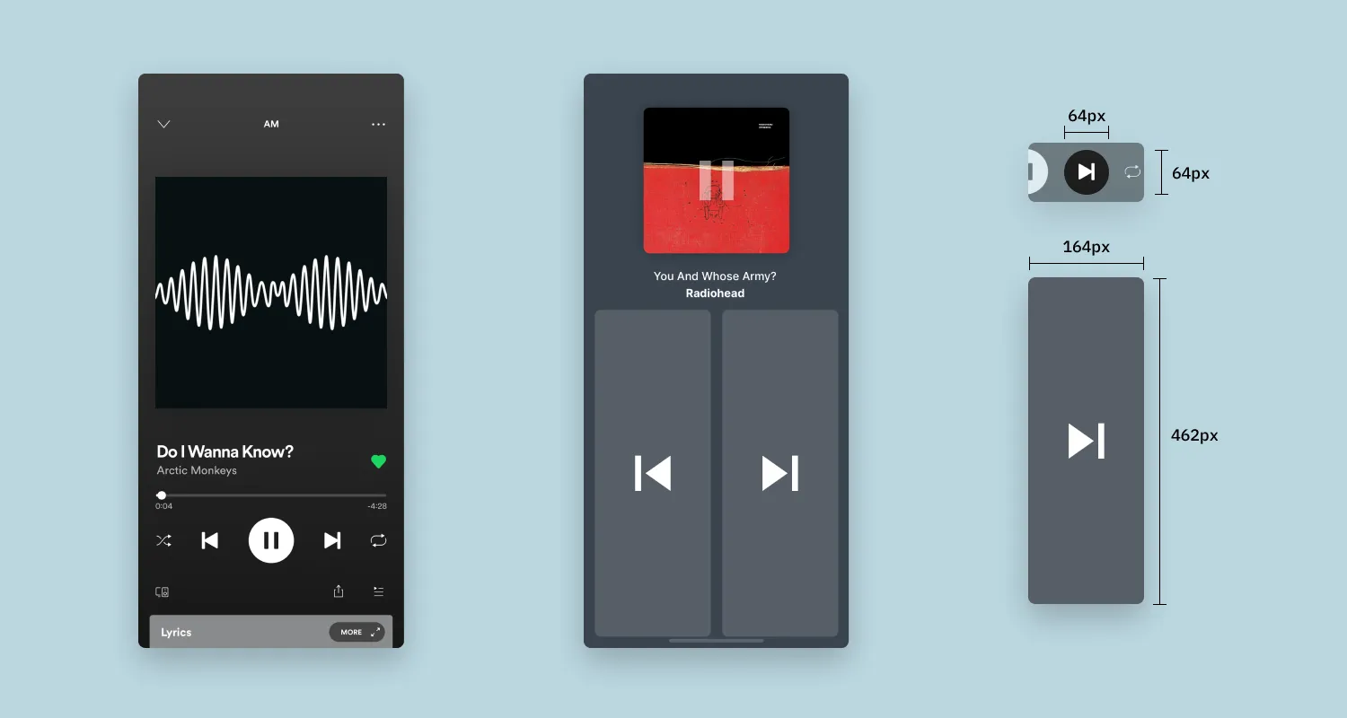
I could tell this difference already when reviewing the footage. When tapping, I kept looking at my finger until I touched the button and the song was skipped correctly (left). When swiping, I stopped looking when my finger was roughly close enough to the screen (right).
User satisfaction
In this scenario, I noticed the difficulty of having to aim my finger at a flat surface with nothing to reach out for. Even though I made no mistakes, I found it difficult to aim my finger at the button without anything to guide it.
I had expected swiping to be easier than the buttons. But the ease of use of big buttons surprised me. It was almost as easy to use as swiping. Still, I slightly preferred swiping. Even though the data shows otherwise, it seemed to require less hand-eye coordination and concentration to me.
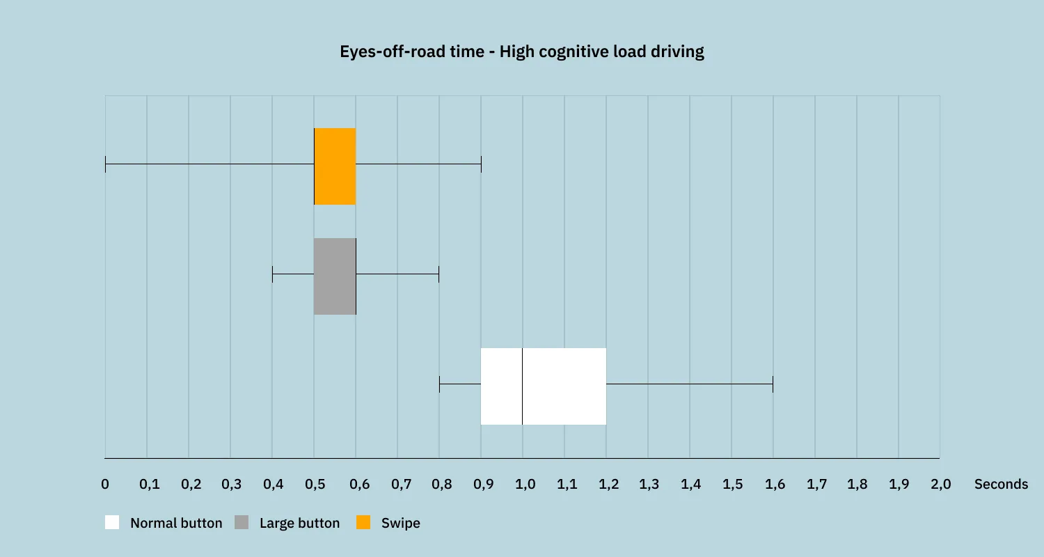
High cognitive load driving
Driver distraction
This experiment produced similar results as the previous, but with interesting developments. Under pressure, I completed each task quicker. But the biggest improvement was for the regular buttons. The mean task completion time was 1,3s versus the 1,7s of the previous experiment. Interestingly, I didn’t see the same improvement in eyes-off-road time. So I performed the physical action of moving my finger to the screen and back quicker. But I still had to glance at the screen for as long as under normal conditions.
In 4 instances, I first looked at the screen, moved my eyes back to the road, and then performed the action. I suspect that under pressure; I wanted to verify the position of the button before reaching out to it. This did not happen for swipes and large buttons. During the two runs with the normal buttons, I made 2 to 3 mistakes where I clicked next to the skip song button.
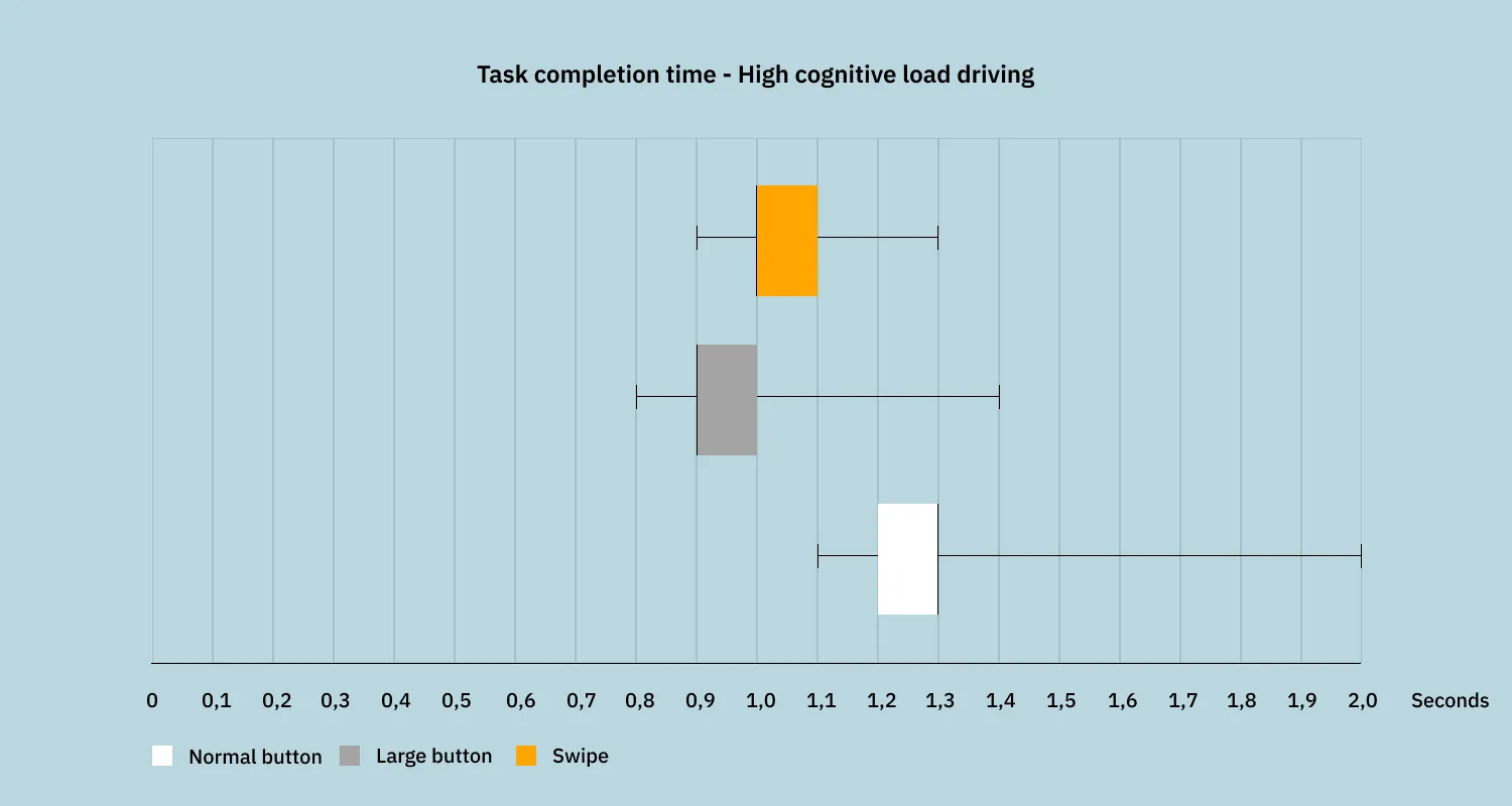
Both swipe and large buttons produced similar results as under normal driving conditions. They were only around 0,1 - 0,2 seconds faster for both task completion time and eyes-off-road time.
Interestingly, I performed 3 swipe actions without having to divert my eyes to the screen. On one of these occasions, I missed the interactive area, and the swipe did not register correctly.
The big buttons have a slightly lower task completion time, which I relate to just having to tap, instead of a longer gesture like swiping.
I tracked some other metrics, like the total time to complete the rally stage and the total number of songs skipped. I don’t value these as much as the others, but I included them because they can give interesting information about the cognitive load of the three cases. Again, both swiping and large buttons performed similarly. For example, the finish times of these two were similar. Interestingly, my fastest time with interactions was 7 seconds slower than without. I did not expect such a big difference, and I also did not notice I was so much slower during the runs with the interactions.
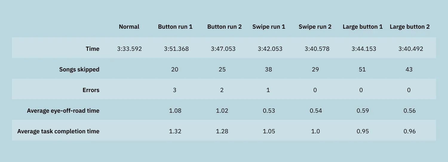
It is fair to conclude that normal buttons require more cognitive load than the other two cases. My finish time was much slower, and I did not skip as many songs. My times for swipe and big buttons were similar, but I skipped quite a few more songs with big buttons.
Satisfaction
The results of high-speed driving amplify the results of normal driving. I struggled with the normal buttons. I made errors, skipped fewer songs, and found it annoying to aim my finger at a small button while having to complete a difficult rally stage. Again, it surprised me how easy I found using the big buttons. With such a large interactive area, I was not worried about making mistakes. I still have a slight preference for swiping, as it allows for less precise coordination. It is enough to land your finger somewhere on the display and swipe in a general direction. Hence, why I could perform a few swipes without having to look at the screen.
Considerations
Looking back, there are a couple of ways my home experiment can be improved. One big drawback of testing in a simulator for this experiment is the absence of road surface movement. My racing wheel has haptic feedback, but the tripod with the phone obviously didn’t.
In drawing my conclusions, I also weighed task completion time less than eyes-off-road time. It depends on how far I placed the touch screen from the steering wheel. When comparing to car interiors, I placed the phone a little too close to the wheel. Though, the information is still useful because of the relative differences between the 3 cases.
Last, it would have been interesting to include a fourth case. As a baseline, testing with real physical buttons would have been an interesting comparison.
With all that in mind, I believe the results of my test are valid. With a little effort, I tested a simple use case and got interesting results. Before starting this experiment, I was more interested in the normal driving condition. I included fast driving more as a fun experiment. After having completed the fast driving, I believe it is actually a valid way to test certain interfaces. The concentration you need to complete a rally stage and the pressure under which to perform the actions simulate real-world stressful situations well.
Should car companies use swipe or tap?
With this experiment, I wanted to explore if there are ways to improve the quick, frequent interactions on touch screens. Before drawing any conclusions, I must mention the obvious disclaimer. This experiment is nowhere near professional or broad enough to conclude that one interaction is better than the other. Though it does not mean that the results are not valid, they clearly point in a certain direction.
I found that both swiping and larger buttons produced significantly better results in driver distraction metrics. Next to that, I found it considerably easier to perform the actions compared to the regular-sized buttons. The difference in both cases is big enough to conclude that it is worth exploring this topic further in a more professional setting.
My advice to car companies is not to add swipe gestures to their infotainment systems. But it is to explore different interaction modes from the perspective of reducing driver distraction. An iPad and a touch-based infotainment system may look the same, but the usage context is fundamentally different. They, therefore, require different design approaches. Researching interactions that are less distracting and at least as intuitive as touch buttons will have a high payoff. It will improve road safety and result in a more positive attitude towards touch screens in cars.
Get notified of new posts
Don't worry, I won't spam you with anything else