How the design of climate controls has gone backward
To illustrate how climate controls have evolved, I’ll compare two generations of Mercedes S-Class: the W140 from 1991, and the newest generation, the EQS.
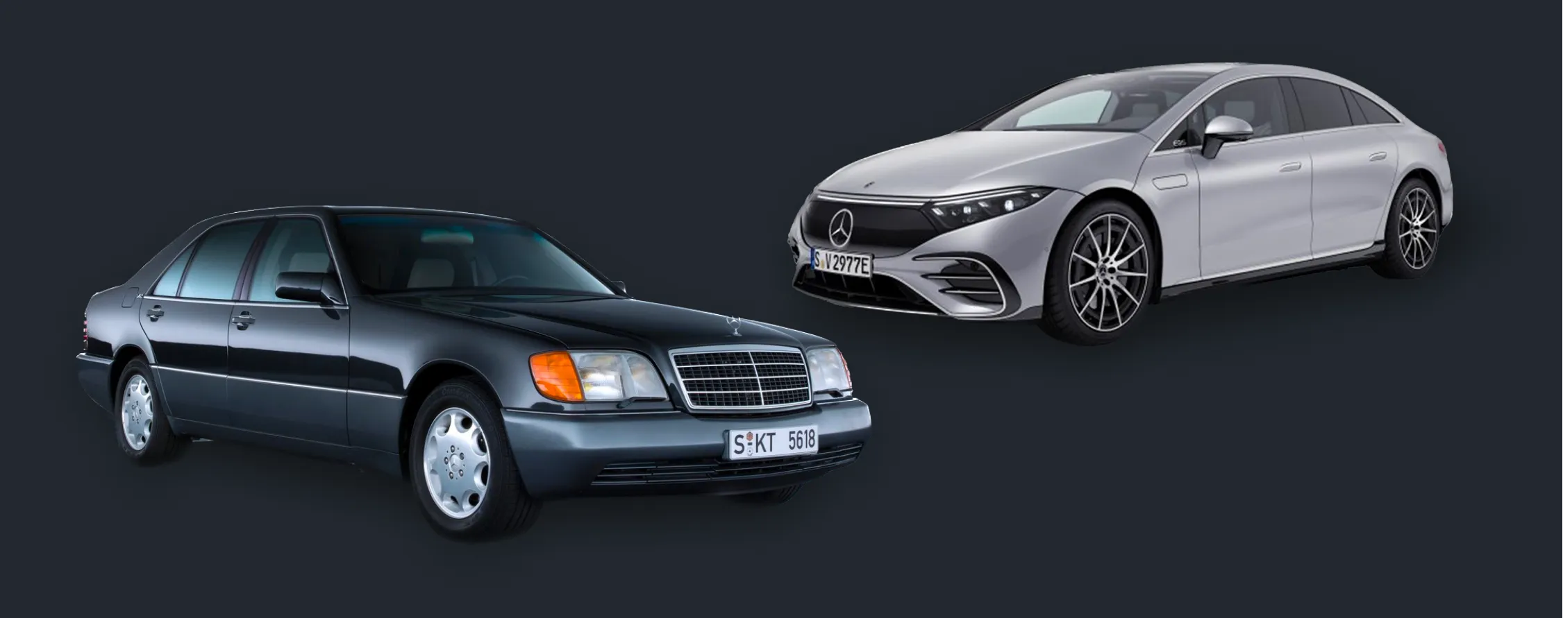
The W140
Even if it may not be obvious at first look, Mercedes spent a lot of time thinking about the design of the climate controls.
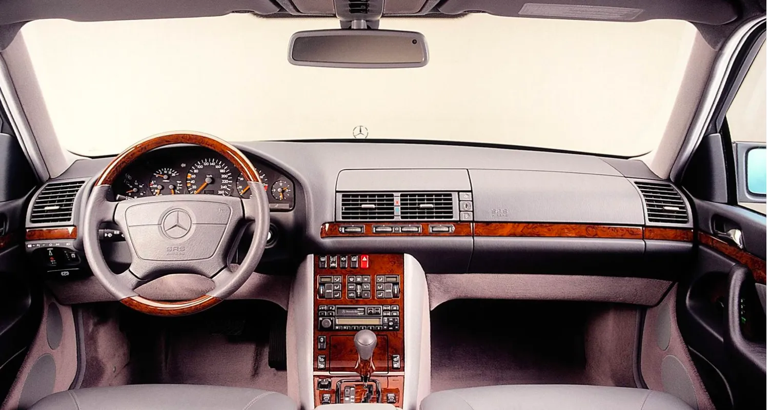
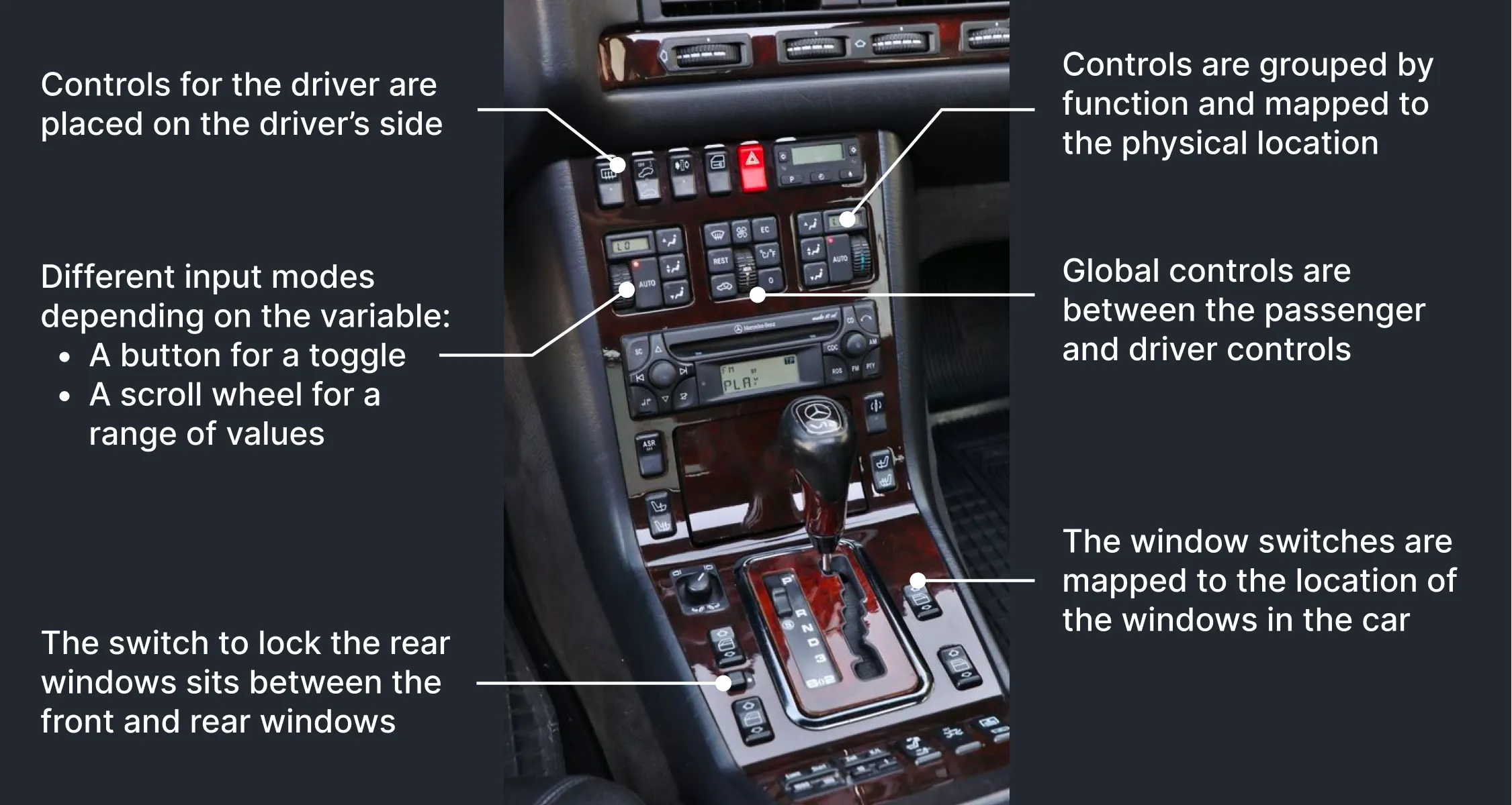
Three points stand out: Input type Depending on what variable they control, there are different input modes such as buttons, scroll wheels, and switches. Each has a clear signifier: you understand how to operate an input just by looking at it.
Information architecture There is a flat information architecture. Everything is accessible with one press, nothing hides in deeper menus. This makes the dashboard look busy but it’s great for the driver.
Mapping The controls are grouped by functionality and mapped to the physical location of the items they control. For example, each front passenger has their own set of climate controls. They are grouped and located close to the passenger. Between these two sits another group of controls. From the location, you can infer that these are global, not specific to a passenger. Another example is the placement of the window switches, which reflect the position of the windows in the car. The rear window lock sits between the front and rear windows, so it is obvious what this control does.
The EQS
Let’s examine the Mercedes EQS to see how the design has evolved.
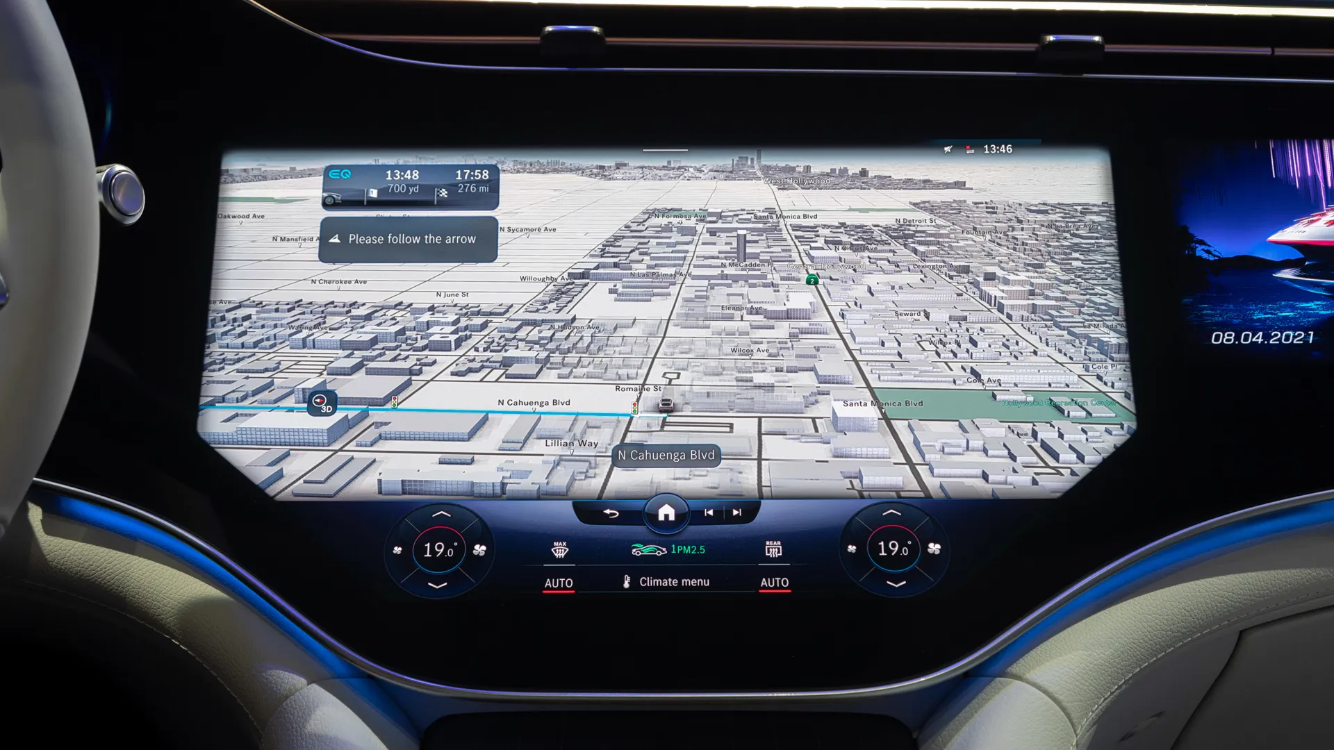
Input type There is a shift from physical to touch-based controls. A touch screen offers much less variety in the types of input. So temperature and fan speed, which were previously controlled using scroll wheels, are now buttons that must be tapped for every increase.
Information architecture Even though the EQS has the largest touchscreen in the car industry, the climate controls share the display with most infotainment features. Compared to the W140, there is much less space for the designers to fit the climate controls. So only the basic controls are permanently visible and the rest is moved to deeper layers in the interface.
For example, before, the ECO mode was a directly accessible button. In the EQS, you have to tap the ‘Climate menu’ and then the ECO button which again opens another window where you can toggle ECO mode.
Aside from the many steps, the UI design feels sloppy as well. First, the signifier of the ECO button is wrong. The design implies that, like the other buttons in this row, it is a toggle that is activated with a single press. But it actually opens another menu where you can choose between two ECO modes. Then, when you turn on ECO mode, a banner appears telling you that there is an increased risk of the windows fogging up and this blocks essential parts of the interface. In the W140, drivers were apparently fine without that message. There is also no indication what the difference is between the two ECO modes.
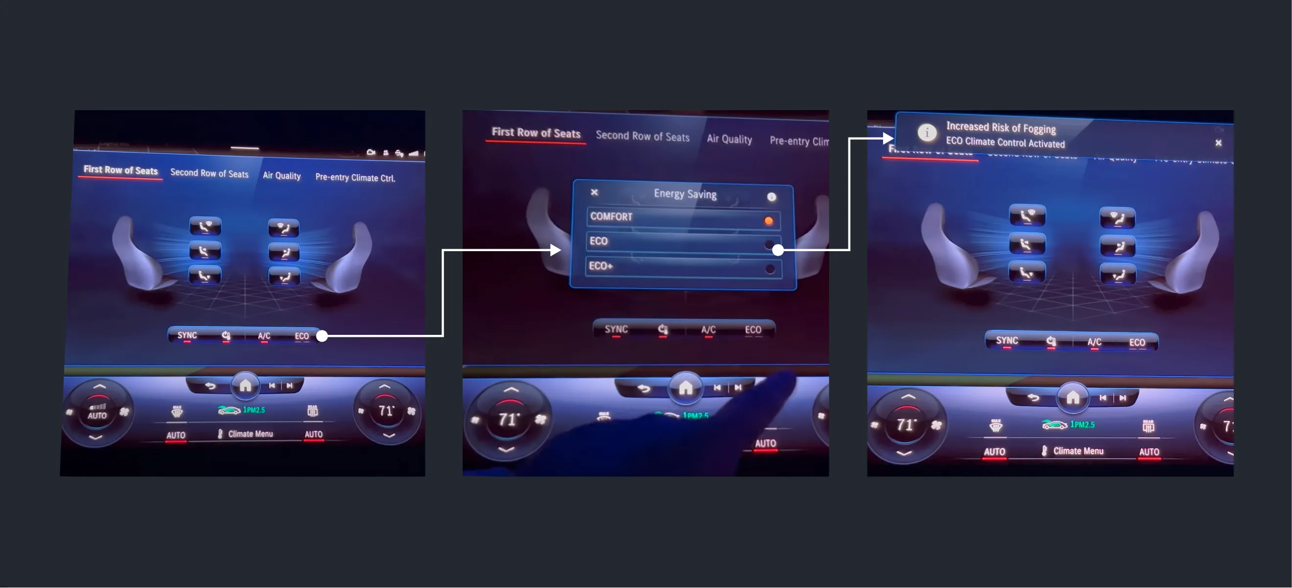
Mapping Whereas before, all of the controls were clearly grouped, in the EQS this is not so evident. The ‘auto’ mode, for example, is not placed together with the temperature and fan speed, but in the center section with the window defog buttons. So it is less clear what the auto mode really controls now. And although there is a spatial connection between the auto buttons and the passengers, this same connection doesn’t exist for the window defog buttons that they are grouped together with.
This general change in climate control design is not specific to Mercedes. Almost every carmaker has seen the same decline in design quality. Even though the rise of in-car software has the potential to reduce complexity, it has done the opposite.
This is partly because the idea behind how climate controls are designed hasn’t changed, but the number of functions and the interaction mode have. So I have been thinking about how to change this for the past months. What would happen if we ignore all this legacy and design a climate control system from scratch?
The first step is to consider the goal of a climate control system.
The goal of climate controls
The main goal of climate controls is to make the passengers comfortable. PO Fanger defines thermal comfort as being influenced by six factors: air temperature, heat radiation, air flow, humidity, activity level, and clothing. The car can control the first four factors.
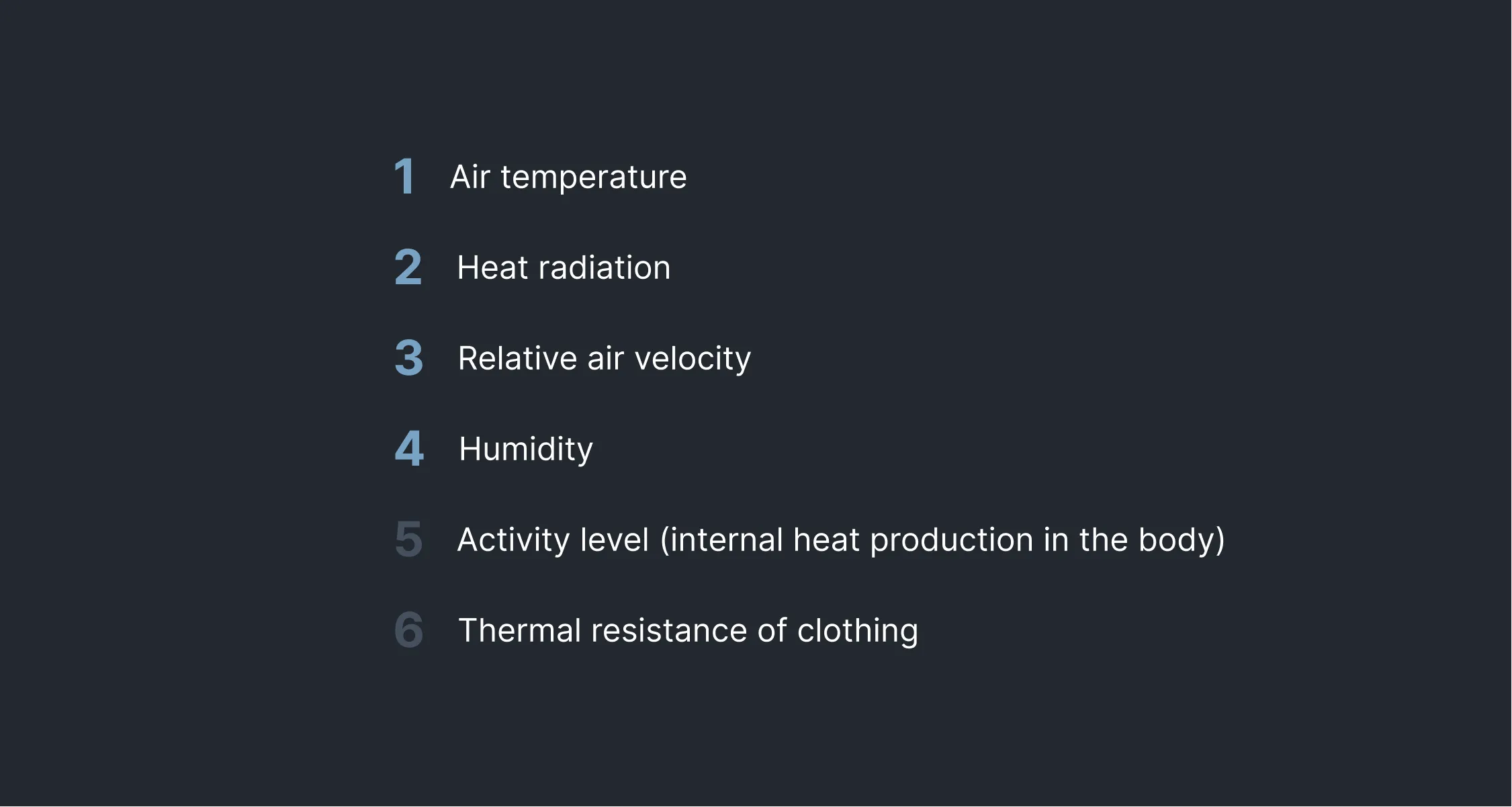
It’s interesting that aside from humidity, these are the main functions of today’s climate controls (temperature, fan speed, and seat heating). The reason why humidity isn’t included in cars, or most HVAC systems, is that it is not possible for most of us to attach a specific value to the humidity level. I wouldn’t be able to tell the humidity level of the room I’m currently sitting in. Therefore it is advised to stick to the acceptable range for indoor comfort, which is between 30-60%.
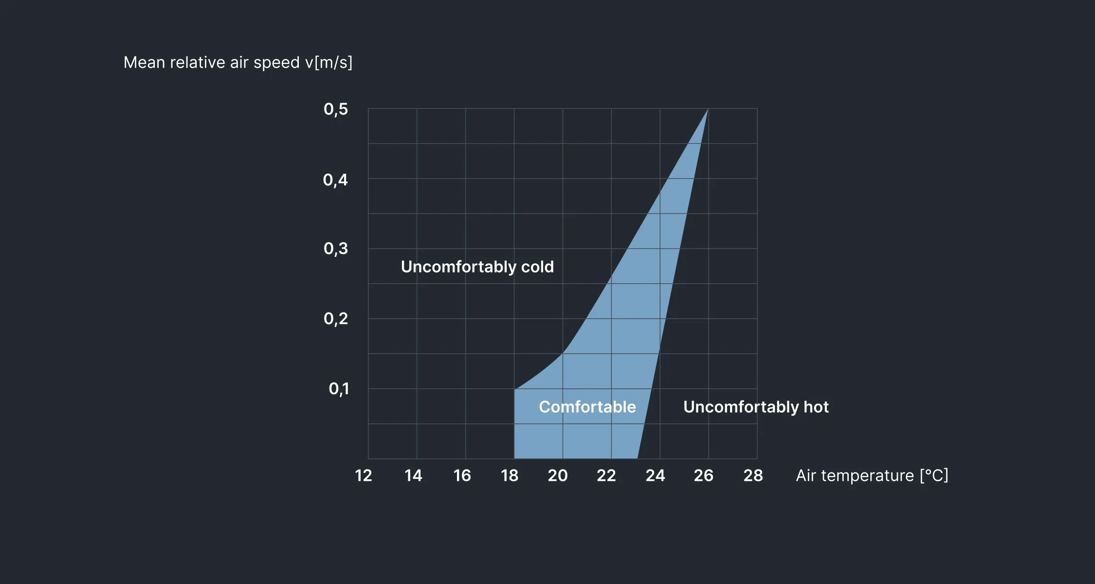
I went into the research thinking that thermal comfort is highly individual. But after spending a, frankly, ridiculous amount of time going through labor health guidelines, I discovered that, just like humidity, there is a range of these factors in which humans feel comfortable. And there are interesting links between the factors. There is for example a clear relation between air speed and temperature.
Furthermore, there is research on how to best warm up or cool down a person. For example, to warm up someone and reach a desired thermal comfort level, it is most efficient to aim hot air at the feet. Conversely, to cool down a person, it’s best to blow cool air at the head.
This got me thinking about automation. A vehicle can know factors like the outside temperature, cabin temperature, which passengers are inside the car, what their preferences are, and how to control the temperature. So an automated system can reach a comfortable thermal range. In fact, most cars come with an automated climate control function that reaches and maintains a set temperature. But we can take that further.
In the car industry, luxury is perceived as having tons of options. Options to configure the car, to personalize it, to set it up exactly like you want. But in most other industries, luxury is taking away as many decisions as possible.
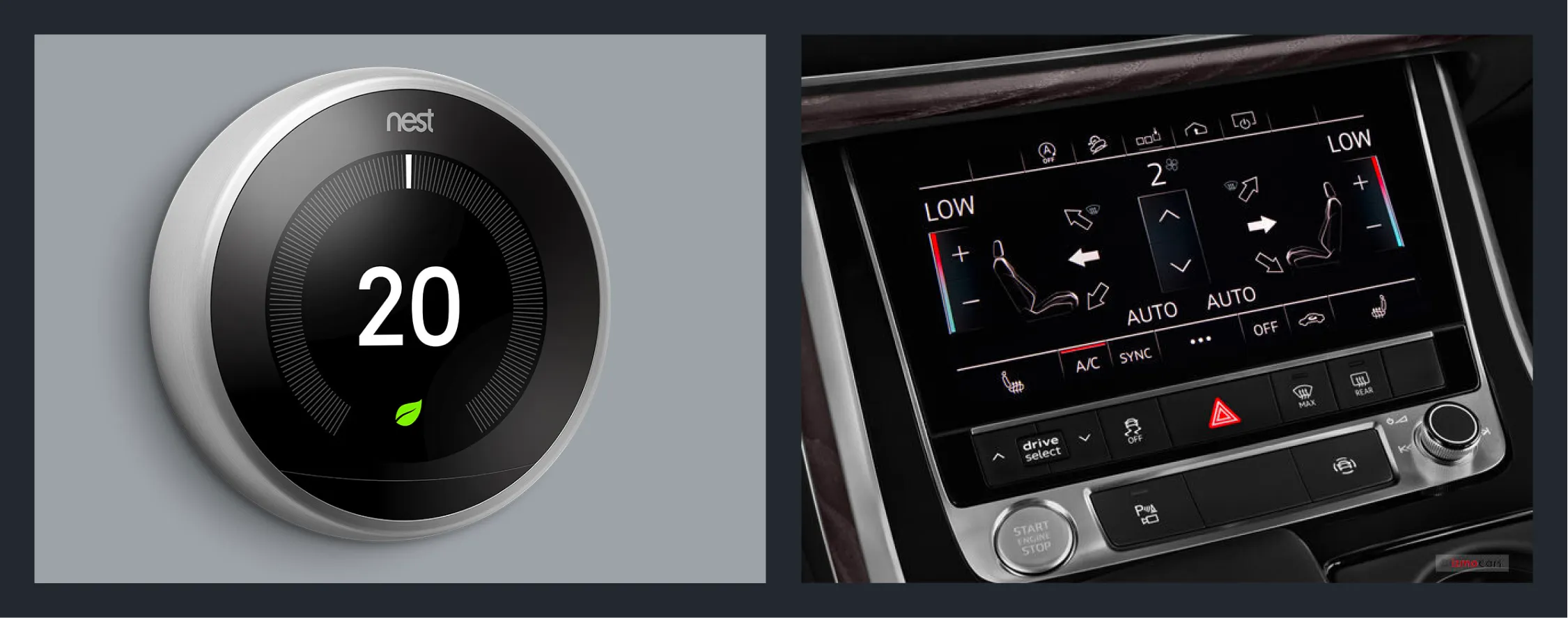
The Nest thermostat is an amazing piece of design because, if everything works well, you don’t have to interact with it. Compare that to climate controls in cars and there couldn’t be a greater difference. That is why I wanted to explore how to keep the number of interactions to a minimum to create a better user experience and increase safety while driving.
The challenge is that within the comfortable thermal range, there will be individual differences between people, gender, clothing, climate, mental arousal level, and more. So there should always be a way to override the automated system. So what should you be able to override and how can we best design that?
First version
I want to create a Nest-like automated system that makes climate controls as simple as possible. You should set the temperature and let the car figure out how to reach that. This should include all climate control functions, such as seat heating and fan direction. Temperature and seat heating are simple to control. Airflow is more complex as it consists of both fan speed and direction. Today, these are separately controlled but there is a relation between the two.
For example, if it is 30°C outside, and I have set the temperature to 17°C, when I enter the car it knows that I’m hot and therefore it should set a high fan speed, aimed at my body with a preference for my head until the car starts to cool down.
Similarly, if it is freezing outside, the car should turn on the seat heating and blow warm air at my body, prioritizing my feet.
When the cabin temperature comes closer to my set temperature, these measures should reduce. The fan speed should decrease and instead of blowing air at my body, it should be more diffused.
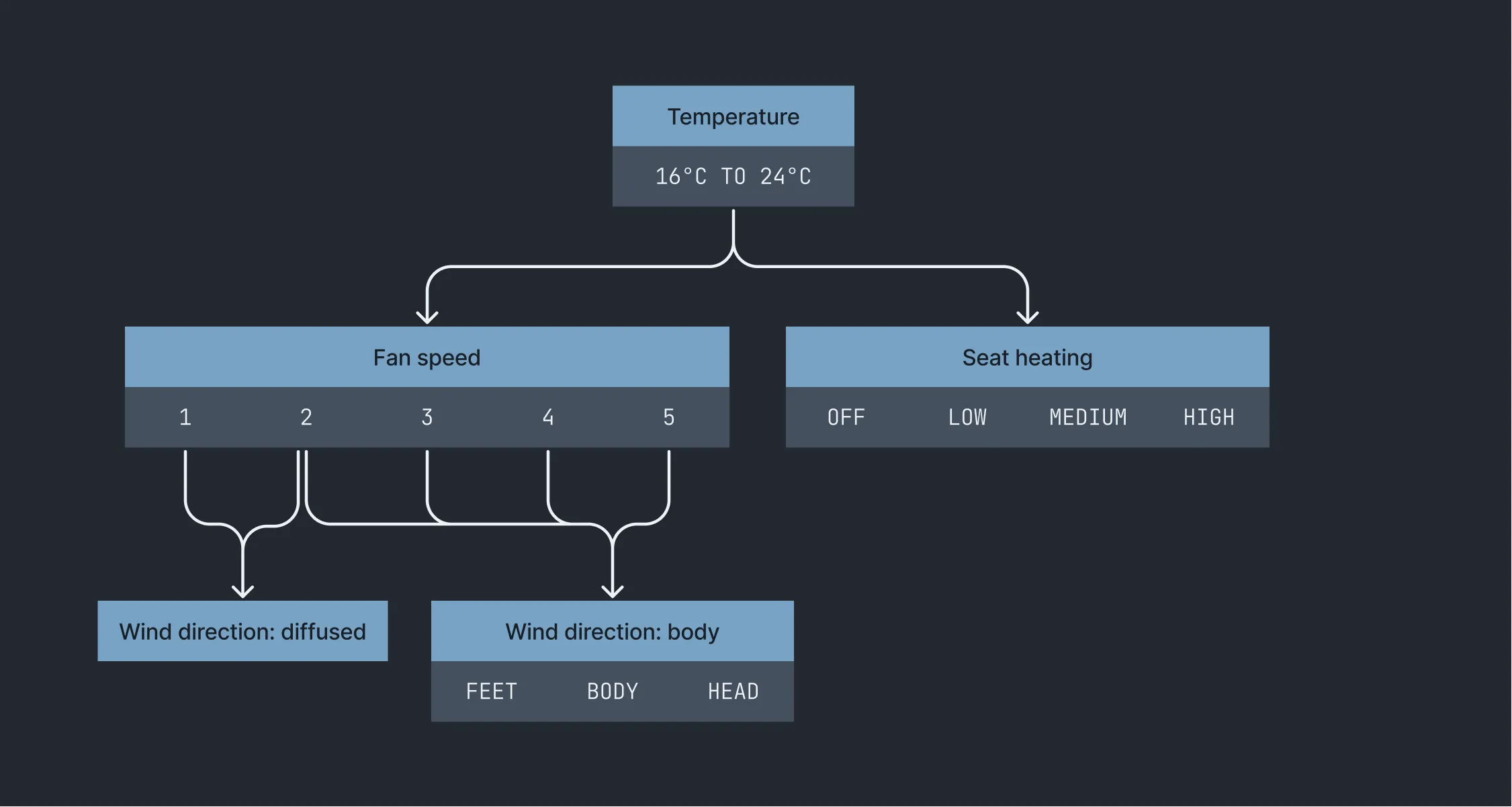
Since fan direction is tied to fan speed, there are two variables that you can override: fan speed and seat heating. These will temporarily override the automated system and at the same time, train the algorithm.
Interaction mode
Temperature, fan speed, and seat heating are all value ranges. In a driving context, it is suboptimal to manage that with a touch screen. Physical dials are the least distracting option. Under ideal circumstances, you only need a dial for the temperature for each passenger. But considering the possible overrides, we’d need 6 separate dials, defeating the goal of making it a minimal system. So what if we mix physical and touch controls? Here is my idea:
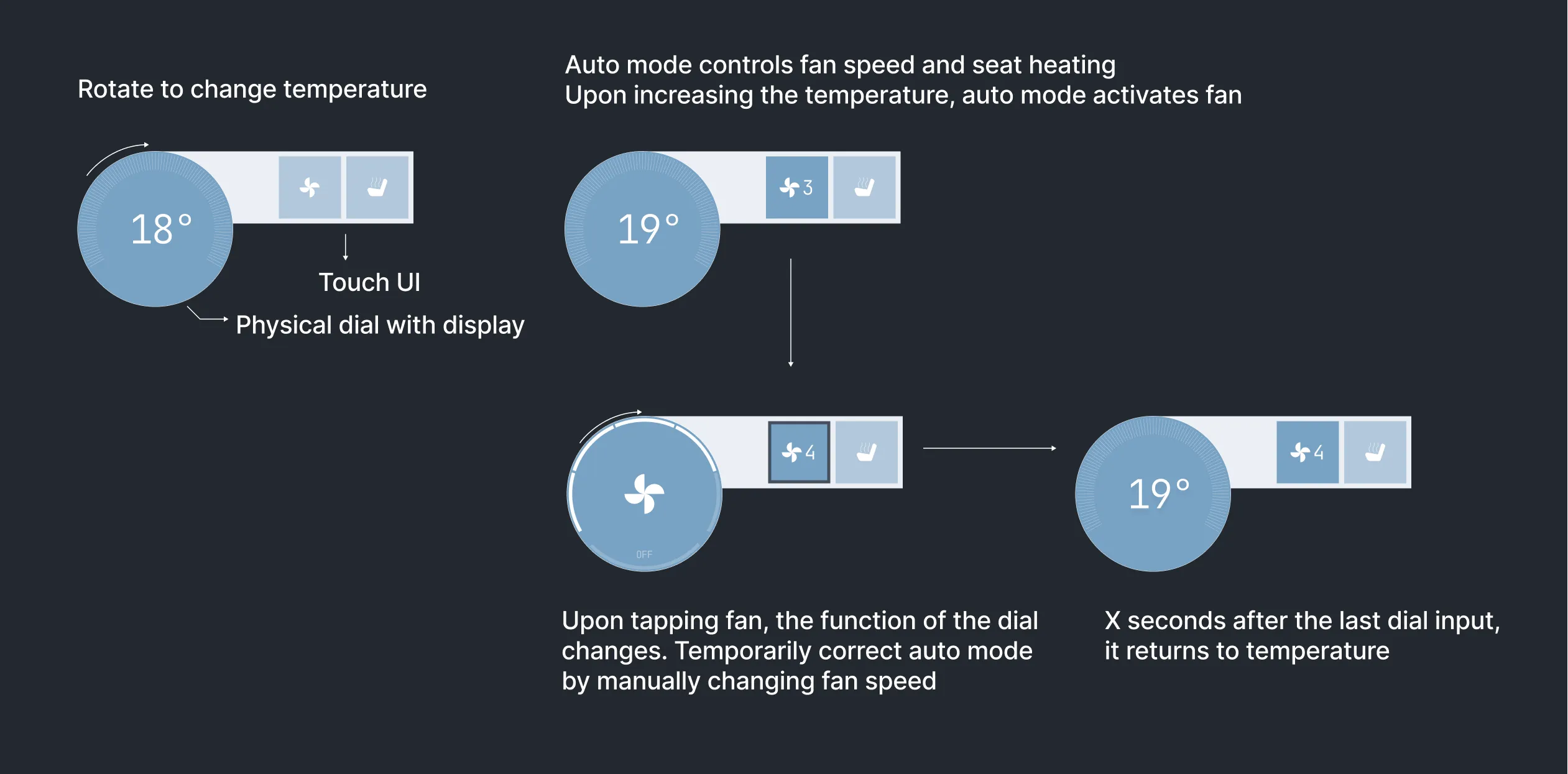
Under ideal circumstances, you only change the temperature using a physical dial. But to override the system, you can select either seat heating or fan speed and use the same dial to change it.
One thing I haven’t touched upon yet is the functional part of climate controls: the recirculate air and front/rear window defog. With today’s air filtration systems, the recirculate air function is something that is automated already so I left it out. Technically, it would be possible to automate the window defog but it is a safety critical part of the system. So there should be a manual override in case it fails. So I have combined the front and rear window defog and included it as a touch button in the center of the interface. As a driver I want the windows to be clear, and the car can figure out how to best do that.
Second version
After finishing the first version and focusing on other projects for a few days, there were two improvements that came to mind. First, after playing with some prototypes, I discovered that the interaction of having to aim for a touch button, and then a physical dial, takes too much time and effort. There is a spatial disconnection between the button and the dial.
The second improvement concerns seat heating. After various conversations with friends about how they use in-car climate controls, it became clear to me that to some, seat heating is not a climate control function but more related to comfort. It, therefore, makes less sense to include it in the automated system.
So for the second version, I removed the seat heating from the automated system and gave it a place in the interface. Now, the automated climate control system consists of two variables: the temperature and the time to reach that temperature (fan speed and direction). By default, the latter is automated but it is possible to override it.
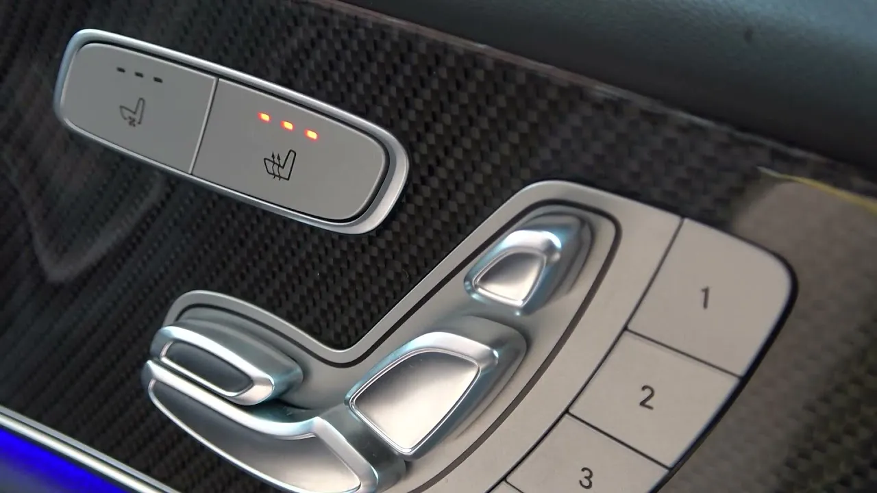
That leaves the interaction mode. For the seat heating, I had a strong preference. I want to be able to set my preferred intensity and simply turn it on or off. One thing I find annoying in most modern cars is that the seat heating is a single button you have to press multiple times to cycle through the intensities. It is the wrong input mode.
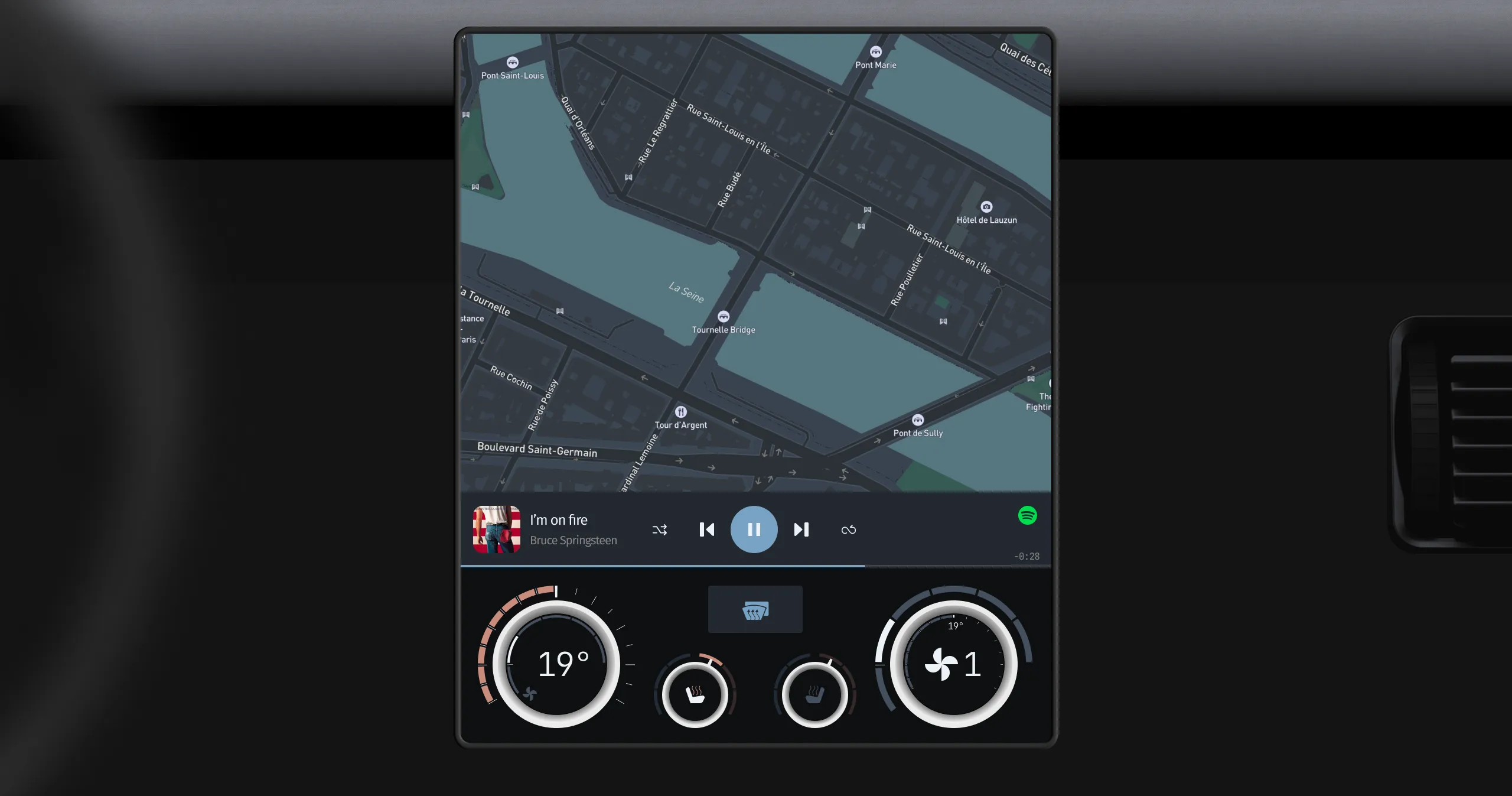
While browsing different types of physical controls, I came across dials that you can attach to a touch screen and are open in the middle, giving access to the touch screen. These are great because the middle of the dial becomes a button that can be blindly reached and guides the finger. This can be used to fix the problem of the spatial disconnect between the fan speed and the dial, and it supports the seat heating concept.
The result is one dial to control the temperature and the time to reach that temperature, and a dial for seat heating. By tapping in the center of the dial, you momentarily override the automated system and control the fan speed, which indirectly also controls the fan direction. Similarly, you can toggle seat heating. Have a look:
I’m currently looking into ways of prototyping this and I’ll write an article once that is finished. Leave your email address below if you’d like to be notified when I release a new post.
Get notified of new posts
Don't worry, I won't spam you with anything else

