Infotainment systems are often overcomplicated and poorly built. Until recently, it was difficult to change this because each carmaker had its own bespoke software platform. But that is changing as most brands will be using Android Automotive. Anyone with Android development experience can now build an infotainment system.
We jumped on this opportunity to launch Snapp Automotive, a company with the goal of improving the quality and design of infotainment systems. Since then, we have been helping many major carmakers with their internal projects. But more importantly, we saw an opportunity to create SnappOS, our own infotainment system. We noticed many smaller carmakers and startups lacked the time or experience to build everything themselves. So we had the idea to create a white-label infotainment system. For the last two years, we've been designing and building this with a small team, and here is how we did that.
Four focus points
Carmakers are excellent at engineering and manufacturing complicated hardware products. But creating consumer software requires a different development process. It's difficult for carmakers to adopt this process, often leading to large, inefficient teams. Most of our team have a background in tech, and we wanted to bring that experience to the car industry. We focused on four core points.
1. Keep infotainment as simple as possible
Carmakers overvalue how much drivers care about the infotainment system. Today's systems try too hard to be an 'experience' and become overcomplicated. This then results in unnecessary technical complexity, which makes systems slow, buggy, and difficult to use.
Instead, we see an infotainment system as comparable to a kitchen appliance. Like a good blender or oven, it can make a difficult task easy without disrupting the cooking flow. When not in use, it should disappear into the background to get out of the way of the main activity, not dominate it.
We faced interesting challenges when creating the first version of SnappOS. Our product targets a wide range of vehicles, from expensive hypercars to low-budget micromobility vehicles. Each vehicle has different features and display layouts. So where do you even begin with the design?
As it turns out, drivers all have the same needs while driving, regardless of the vehicle. They want to listen to music, use a navigation app, and, occasionally, make phone calls and adjust driving settings. So that is where we started.
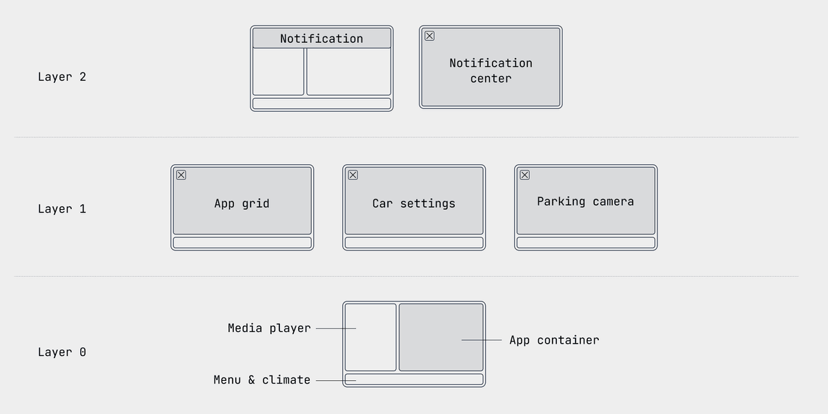
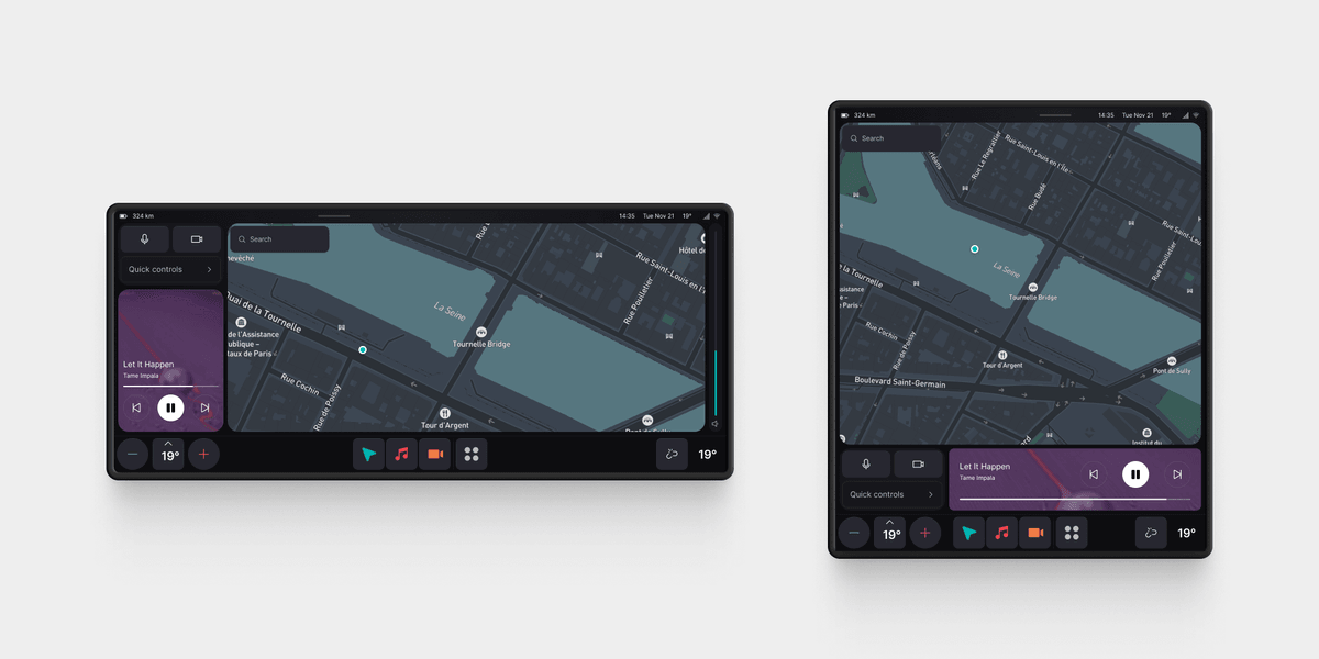
We created a range of possible display layouts that we used to verify our designs wouldn't break.

Then we started iterating, asking ourselves at each step: 'Can we make this simpler?' If so, we continued until we had the simplest architecture.
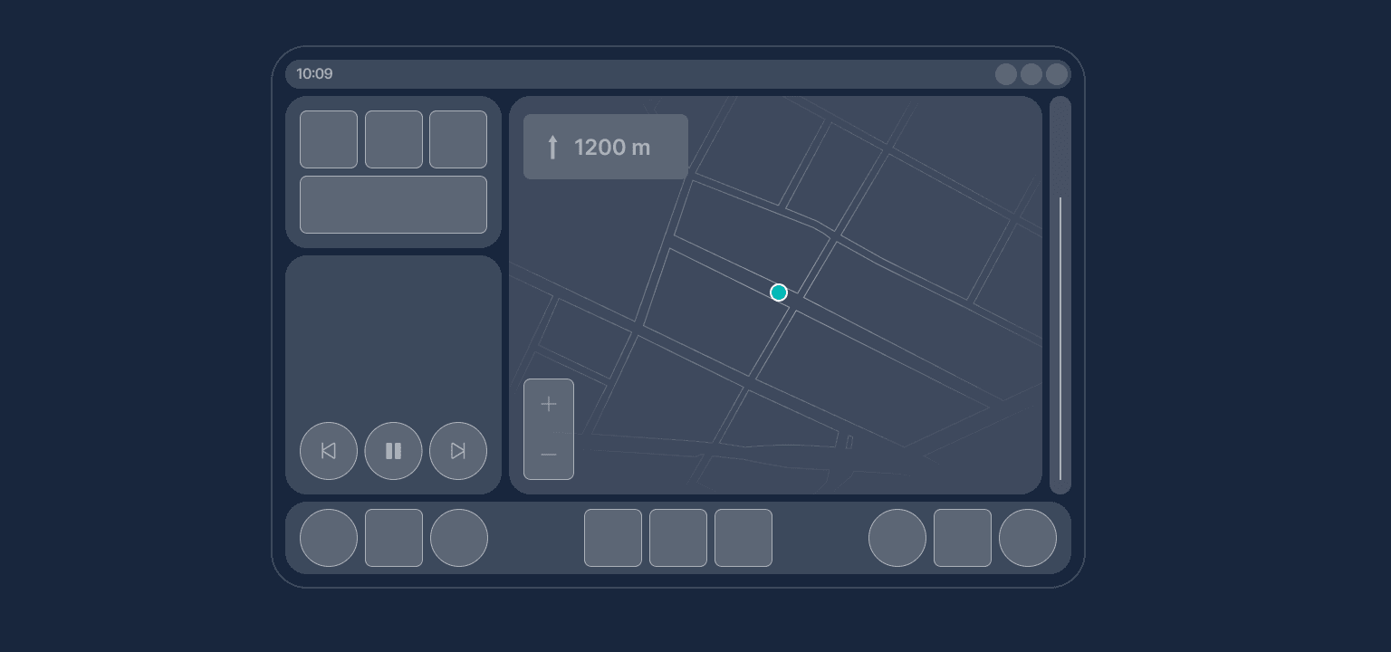
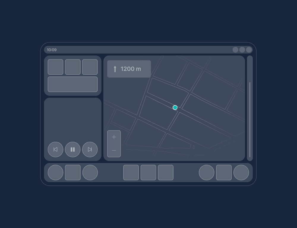
The result was a home screen with a menu bar that includes climate controls, a permanent media player, and a container where the apps open. By default, it's filled with the navigation app. For special cases needing space and focus, specific apps or features can open full screen. For example, the app grid, parking camera, and car settings.
With that in place, we created a basic UI theme for the system, resulting in the first version of SnappOS:
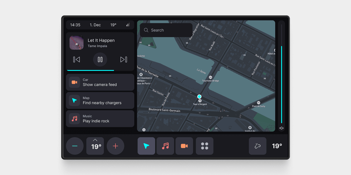
We chose a menu structure similar to CarPlay and Android Auto, with the three most recent apps. Below the media player, we created smart suggestions. The idea was to reduce visual distraction by speeding up interactions that usually take a long time. For example, finding nearby chargers or playing a specific playlist.
2. Small, cross-functional teams
To reach the first version, we prototyped in Figma. This works well for simple interactions. But an infotainment system is a small operating system and testing things like how apps interact with each other, or how notifications work, is impossible in Figma. There are also many limitations from a technical perspective that we wanted to discover as early as possible. That's why we switched to prototyping directly in Android.
One challenge in developing an operating system is the lack of infrastructure to deploy and test software. So we created our own developer tools. We started by modifying Samsung and Pixel tablets to run Android Automotive. Then we created our own firmware updater and app store. This meant we could push updates to the operating system and apps whenever needed.
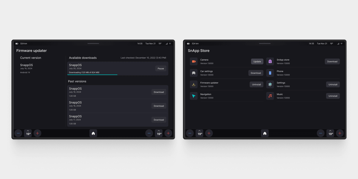
As a remote company, collaborating was easy this way as every team member had a tablet with our operating system. I can mount a tablet in my car to test a concept and give feedback to the developers. They then tweak the concept and push an update that I can install and try right away.
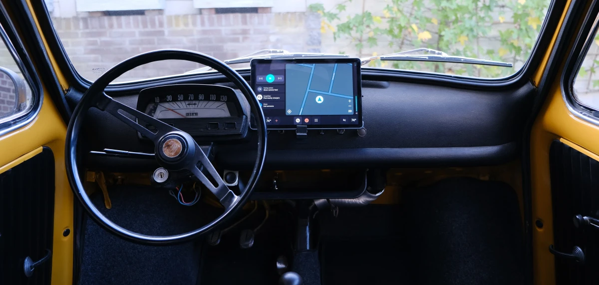
This also means that design isn't only restricted to designers. Because developers take part in the design process, we can play around with ideas that require a deep technical understanding. For example, it's not a great experience to repeatedly aim for a touch button to change volume or temperature. A slider may be better while driving because the driver has a larger area to aim for and sliding is an easier interaction than pressing a button. Prototyping this directly in Android works much better than any design software.
3. Safety first
In automotive interior design, ergonomics and human factors have taken a backseat to flashy screens and trendy UI design. Anything a driver does behind the wheel other than driving is dangerous. Many infotainment systems aren't designed with safety as the main priority.
As I've written about before, having all controls on a touch screen is unsafe. Unfortunately, we can't control these decisions when we work with a carmaker. But we make what we can control as safe as possible. For instance, by minimizing visual distraction, reducing task completion time, and ensuring touch targets are large enough to be easily reached by the driver.
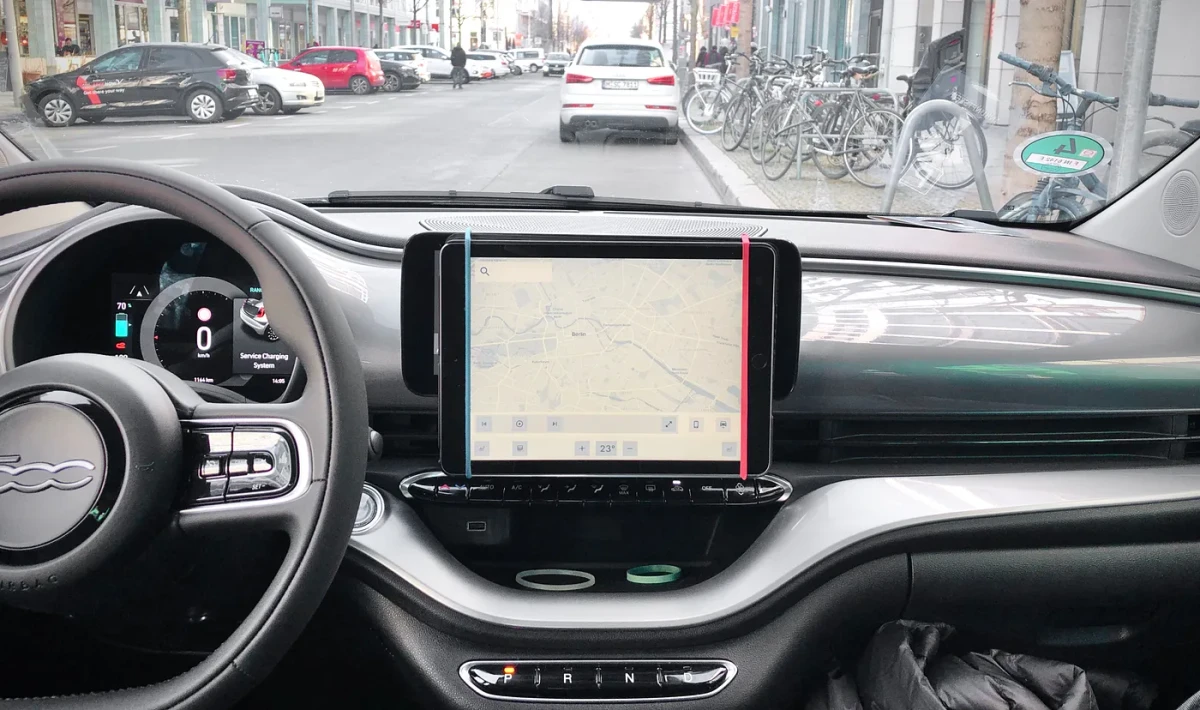
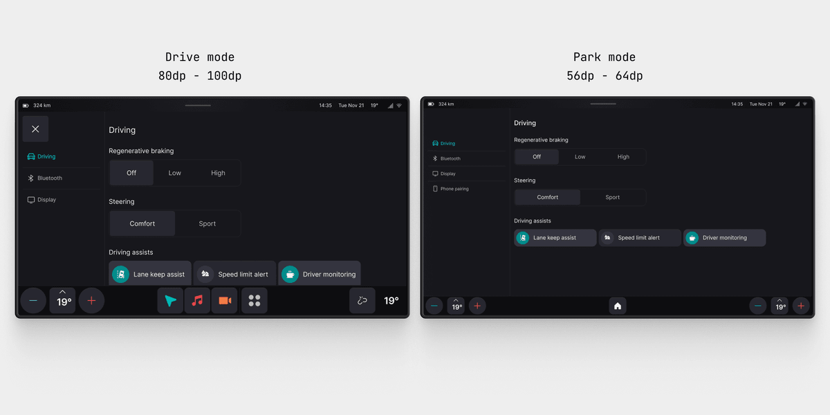
One challenge was the lack of clear guidelines for text and touch target sizes. Existing ISO standards are difficult to interpret and rather lax, so we created our own. We made a couple of Figma prototypes and tested them on Berlin's bumpy streets to explore the impact of different sizes on usability. We found a significant increase in usability for each size increment until reaching a point around 80px to 100px where the effect becomes less significant. We converted these to the right pixel density and set them as minimum values. Over time, we expanded and improved these as we tried different vehicles and display sizes.
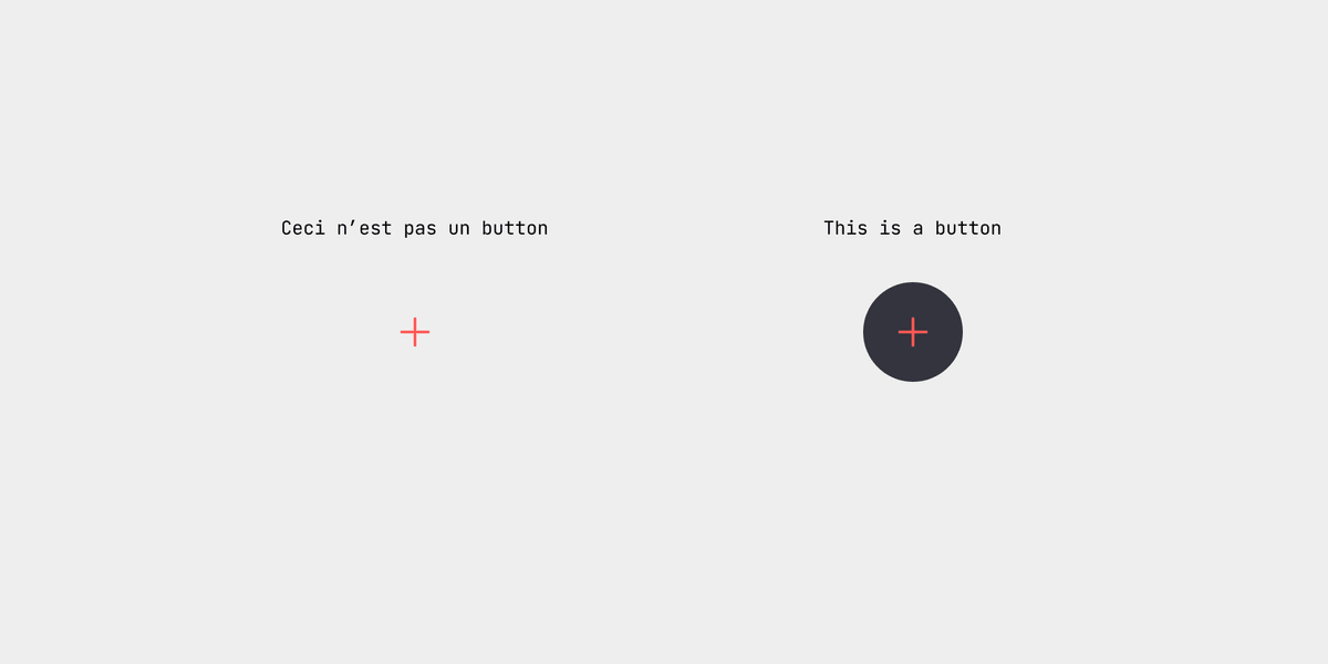
Another point we focused on was creating clear affordances. When designing a smartphone app, you can assume your customers understand common touch interaction patterns. This is less the case with vehicles because the software isn't the reason why people buy a car. Furthermore, drivers don't have the cognitive and visual capacity in stressful situations to look for the right UI element to press. The interface must make it as obvious as possible.
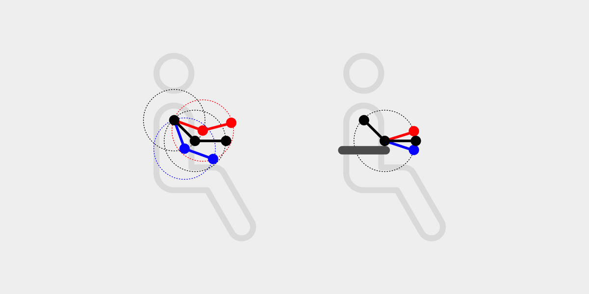
One thing we are still working on concerns touch targets. Much like small touch targets on smartphones, there is often a difference between where it looks like you are tapping and where your finger is touching the display. This can be exaggerated by the vehicle's interior layout. If you aim for a button in the corner furthest away from you, it may look like you're hitting it, but in reality, you may be right next to it. By separating the touch target from the button, we can calibrate it for the interior layout and increase it to make it less error-prone.
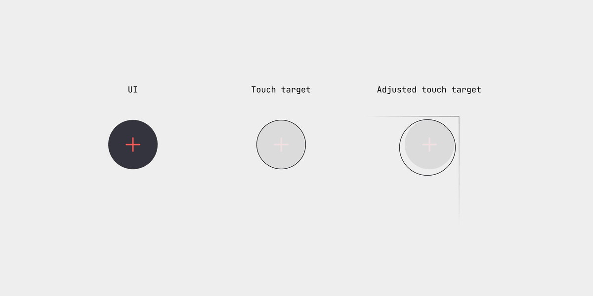
Big differences exist in interiors that affect this calibration. If drivers can place their elbow on an armrest and easily reach the display, there's one less degree of freedom which makes it easier to aim for a button.
4. Adapt to the context
The last point we focused on is making the interface contextual. When studying how people interact with their vehicles, we realized there are three distinct contexts: driving, parked, and away. Each context has different goals and needs.
When driving, only the few core features that help drivers get to their destination comfortably are needed. We removed the rest, which greatly reduced the complexity of the interface which in turn makes it easier to navigate. When shifting to Park, the system opens up and becomes more like a tablet, designed around apps. All apps and features are now available, with each app opening full screen rather than in the container optimized for multitasking in drive mode.
Additionally, we reduce the sizes of the texts and buttons because distraction isn't an issue.
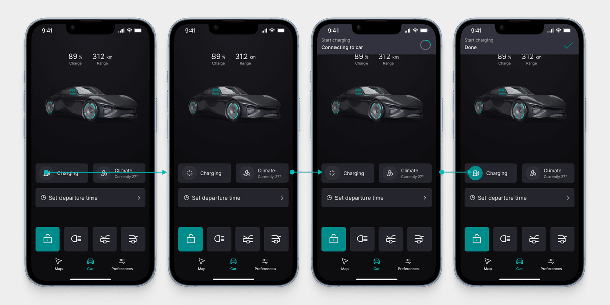
The third context is often overlooked. This is when the driver is not inside the vehicle. Today, companion apps are more like a remote control for the climate settings, but they can do much more. Carmakers often think the car is the center of the experience and look at a flow like this:

Whereas in reality, it looks more like this:

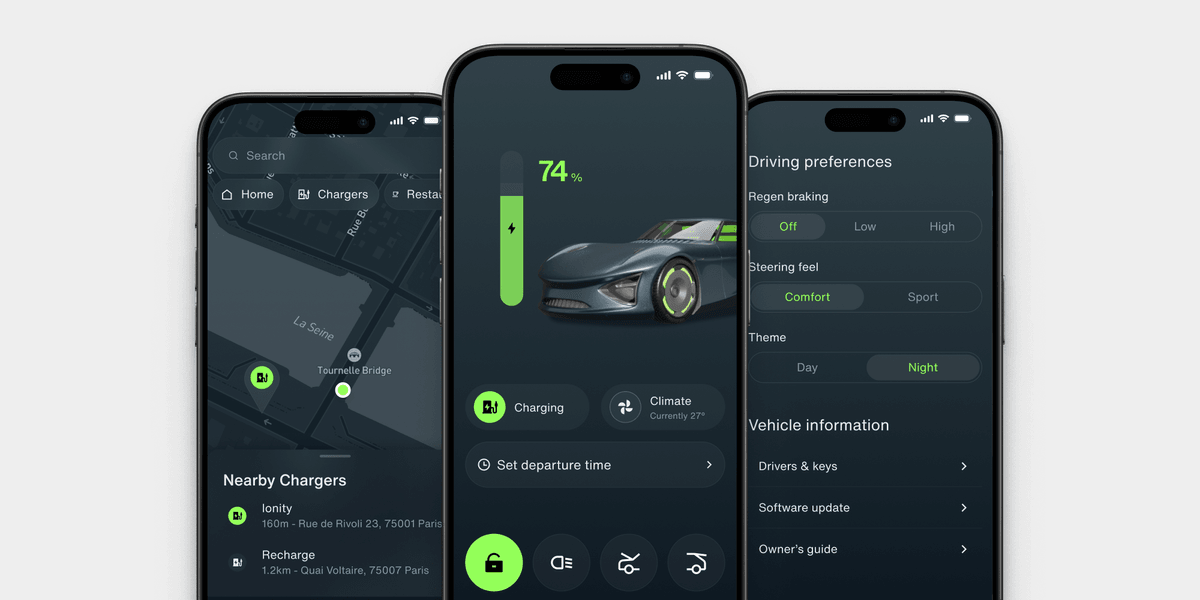
That is why we designed SnappOS from the start with a mobile app. The main challenge with a mobile app is not which features to offer, but how to handle the communication between the phone and the car. For example, cars are often parked in underground garages with poor cellular reception. That is why we focused most of our attention on developing a dependable communication method. The most important part of this is clearly informing the driver about its status. The app communicates if the phone fails to send data or the car fails to receive it, and explains what happens when the connection is lost.

Once the communication is reliable, you can make the app a core part of the system. When entering a car, most drivers are busy with getting to their destination and don't want to 'play' with the infotainment system. Much like the difference in driver needs between park and drive mode, there are so many features that make more sense in a mobile app than the car. For example, the driving and charging history, maintenance status, personalization, or even settings like custom drive modes. By moving these to the mobile app, drivers actually use them, and in-car systems become easier to use.
With the four main points as a basis, we have been gradually developing and refining the product over the last two years. Here is what it currently looks like.
Overview of the current system
What we have today is a base infotainment system with a set of core features. We designed it to be easily customizable. When we work with a new carmaker, we adjust it to the screen size, add custom features, and customize the UI. All without breaking the core interaction patterns.
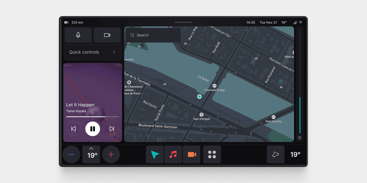
Side column
The main change from the first version is the side column. We decided to pause the smart suggestions idea. We lacked time and data to train a model, so we'll do it in the future.
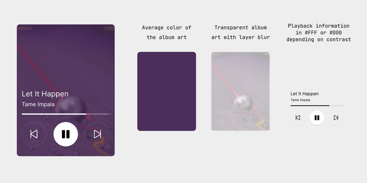
Instead, we had the idea to create a customizable set of car controls and a larger media player. The media player is built up out of different layers.
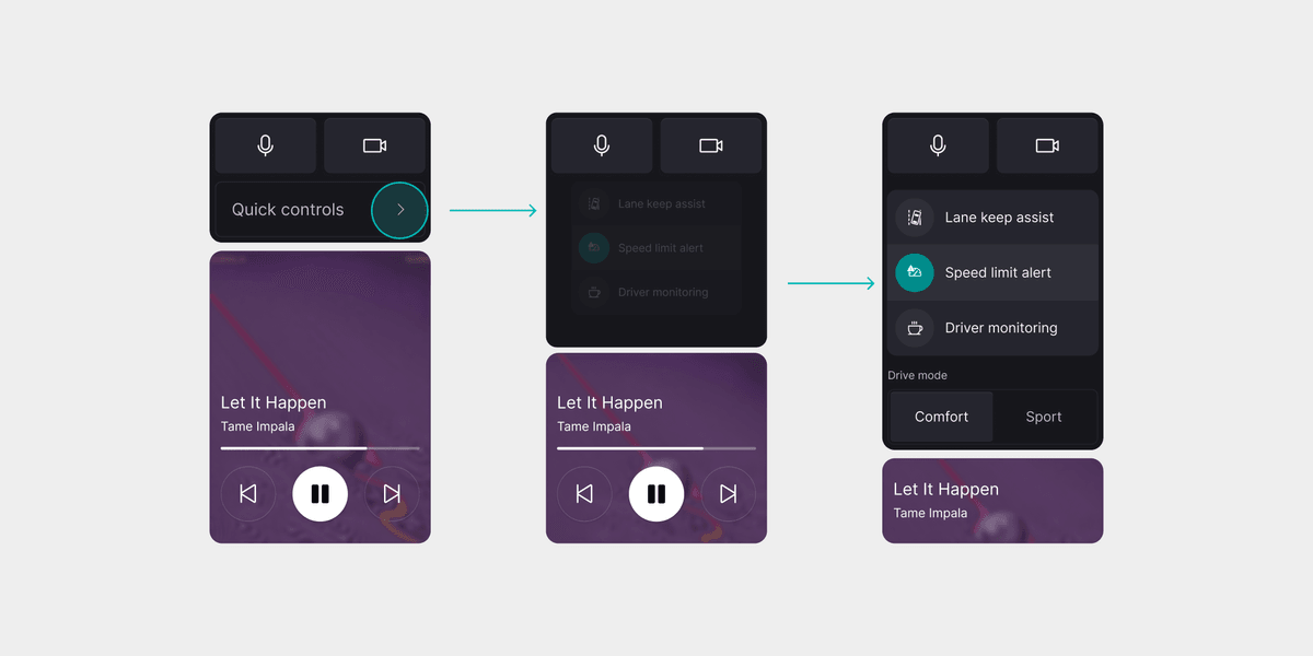
The car controls are available in park and drive mode. We can customize them for each carmaker and include things like the most used settings or shortcuts. There is access to two shortcuts for features like voice input and the parking camera. When expanding the section, there is space for specific car controls. In our concept, they include toggles for the driving aids and the drive mode switch.
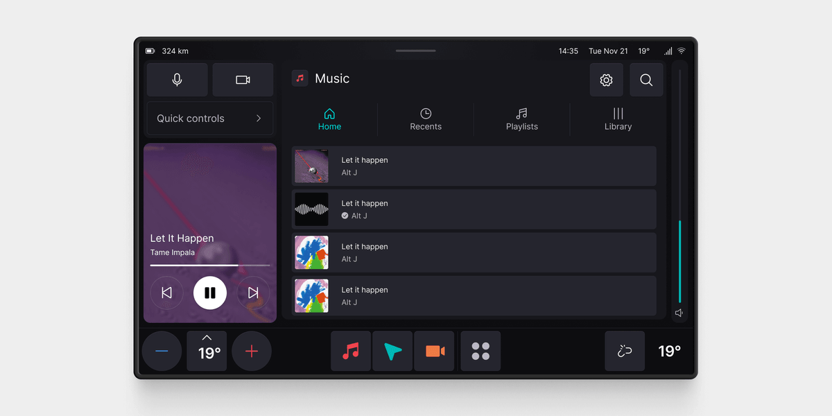
App container
The app container remained the same. When opening an app, it will appear in the main app container. This is the navigation app by default, but any driving-related app will open there.
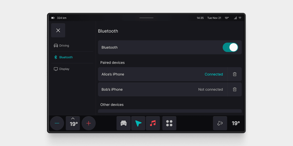
We created templates for system apps like settings and charging so that we can easily adapt them to each carmaker we work with. The settings app opens full screen when driving for easy access.
Menu bar
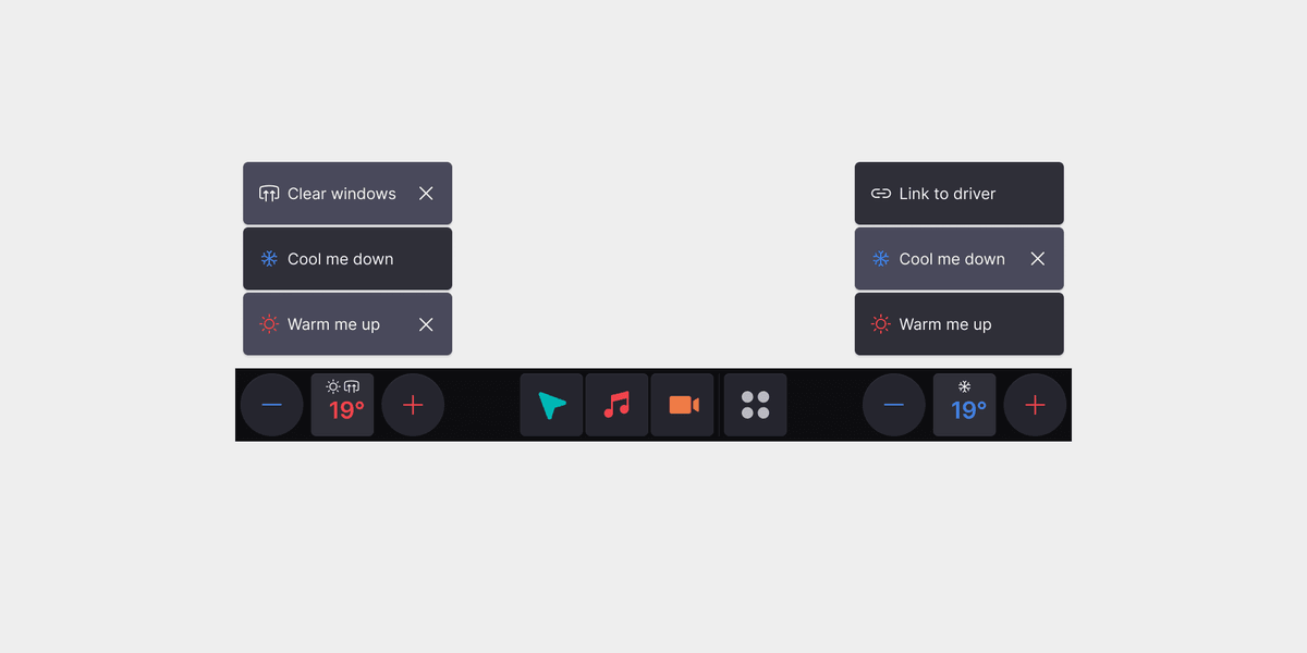
The menu bar includes the climate controls and the three most recent apps. The climate controls will be adapted to the vehicle. For demo purposes, we played around with the idea of keeping the climate controls as simple as possible. As I've written about before, most climate controls are too complicated since modern cars are good enough to regulate temperature automatically. That's why we designed these controls to be automatic, with only two overrides: 'warm me up' and 'cool me down' in case the system isn't responding well enough.
Notifications
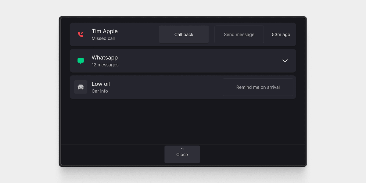
Notifications are a necessary evil. Google requires every Android Automotive system to have notifications and a notification center, so we ensure they're as accessible as possible.
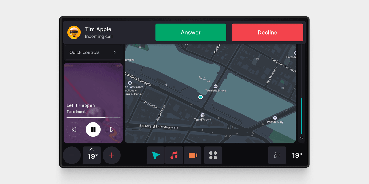
The notification center can be triggered by swiping from the top of the screen or a button press, depending on the vehicle's interior layout. If the screen is deep inside the dashboard, it's tricky to reach the top edges and a button is better than a swipe. To close it, we replace the menu bar with a big close button because swiping from that angle is tricky and it makes it impossible to miss how to exit the flow.
3D
3D scenes are increasing in popularity in the car industry. Although they are more of a decorative element, they do have some design value. They do a great job of communicating the status of the car. For example, which doors are open, what drive mode the car is in, or anything related to charging. We offer the option to carmakers to display a 3D model in park mode which reflects the status of the vehicle.
Customization
Customization is the most important part of SnappOS. In a fraction of the time that it would normally take, each carmaker we work with can have a bespoke-looking infotainment system. The system can be customized through the interior layout, the included services, custom features, and the UI theme.
Layout & services
Android Automotive comes without pre-installed apps. We've built a base set of car-related apps for charging and settings, but can't offer a navigation app or an app store. For that, we connect carmakers to the right services depending on their needs.
Next, we adapt the layout to the screen dimensions and develop custom features. For example, an off-road vehicle will have a set of custom features and unique settings to support the different needs of off-road drivers.
Creating a bespoke UI theme
The most important part of customization is the UI theme. At the core of this sits our custom theming engine. The theming engine's core idea is simple. Every customizable element has a token assigned, which can store any string or integer. Tokens include typical things like colors and fonts, but also icons, radius, spacing, effects, app icons, and operands like booleans. By changing the value of the token, we change the UI theme. This allows us to customize the UI entirely without having to rewrite any components.
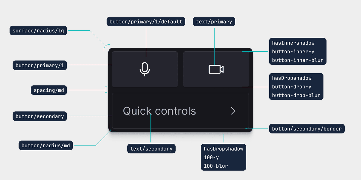
We document everything in the extensive design system that we built in Figma. Thanks to the recent release of Figma's variables, we can have exactly the same setup and definitions as the theming engine. Each UI theme is defined by approximately 200 tokens. This is a lot, but it ensures that we can create widely different themes. We only have to export the list to the theming engine to create a new theme.
The same list of components and tokens is used for the companion app to maintain consistency.
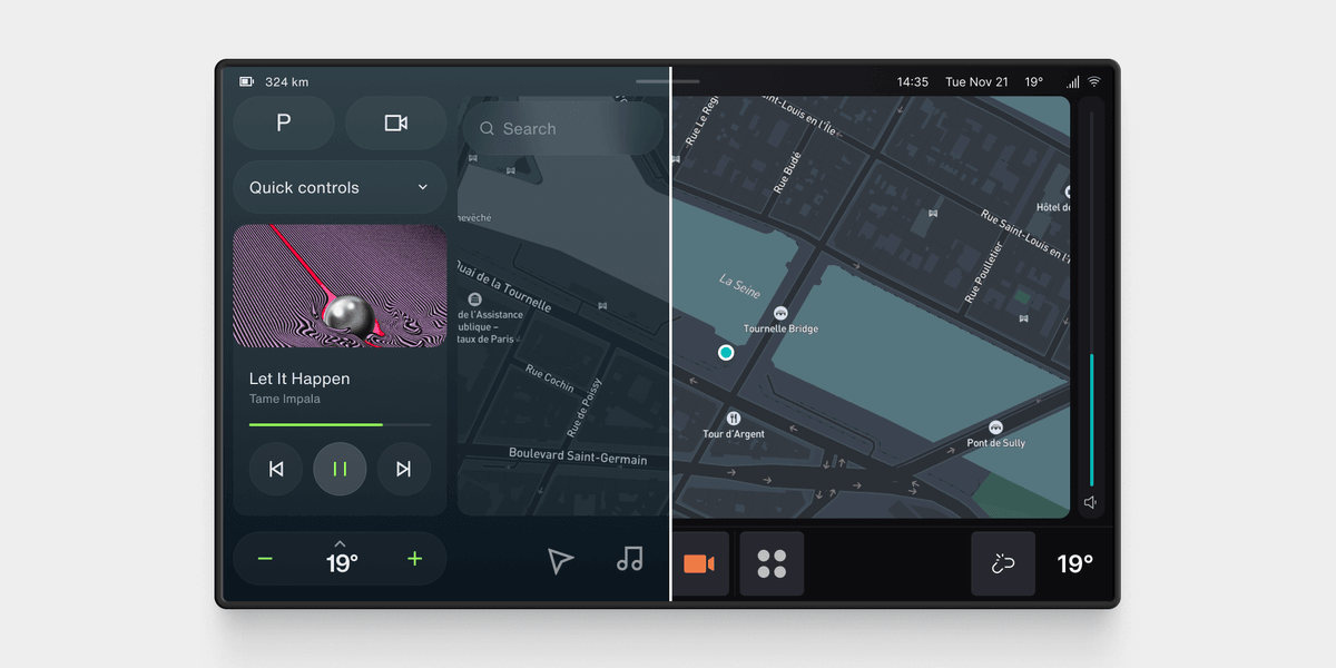
However, not everything can be automated. There is a small set of components that heavily impact the design of the system. Even though our tokens offer extensive customization, it's not enough for these components. That is why we have to style these 'by hand'. One example is the media player.
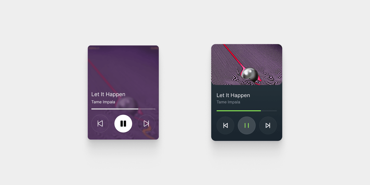
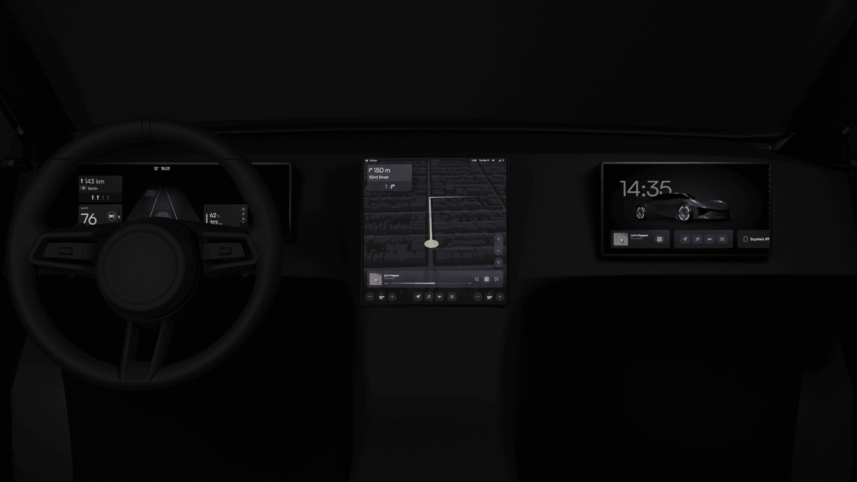
With these three layers of customization - screen layout, custom services and features, and UI customization - it's possible to create infotainment systems that look totally different from each other in a fraction of the time it would normally take. For example, for a luxury car with three screens:
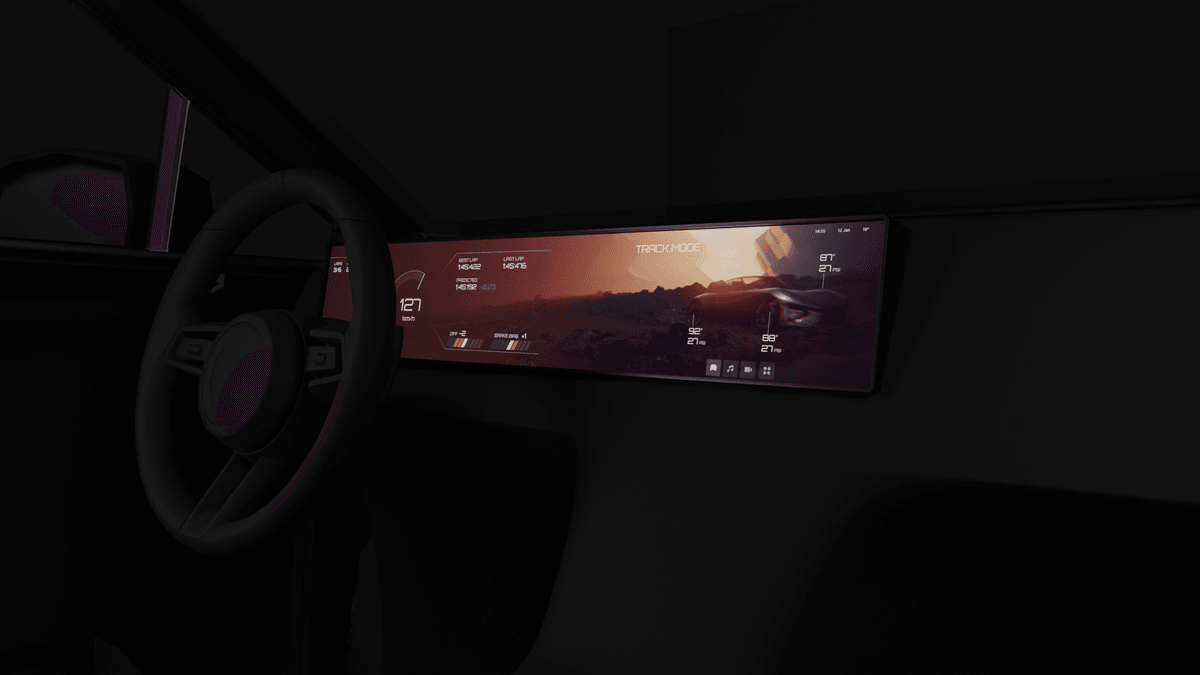
Or one for a sportscar with a super wide display:
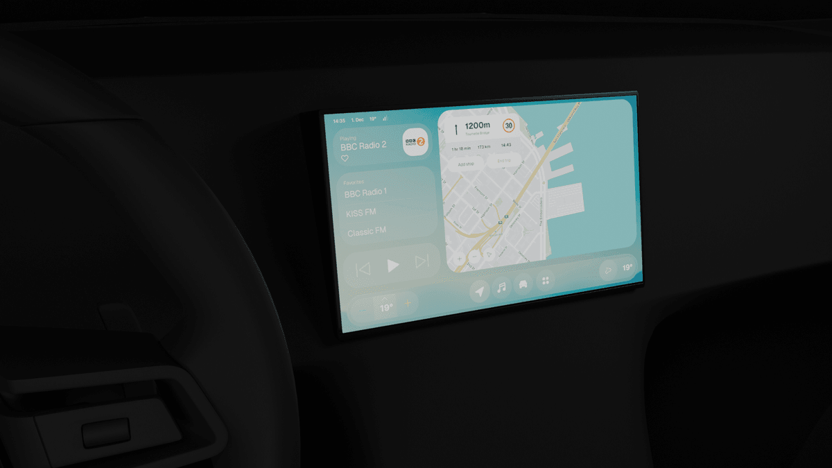
Or one for a small city vehicle aimed a car-sharing:
Where are we now?
We're working with several carmakers to integrate our system. Our potential customers produce a wide variety of vehicles, which makes it really fun to work with them. Additionally, we are now working on a dedicated hardware platform for our product so that we can offer everything as one fully integrated solution. In the coming months, we hope to share more public information on this!
Get notified of new posts
Don't worry, I won't spam you with anything else
