

Designing for Trust
In regular taxi rides, there is a form of trust between the passenger and the driver. Most of it is established through communication, both verbal and non-verbal. As a passenger, you might ask the driver the arrival time, or check if the driver noticed a pedestrian trying to cross the road. But when it comes to driverless cars, how can you build this trust?
Waymo’s designers faced an interesting challenge in trying to answer this question. Coming up with solutions is difficult because there is not a lot of data about how humans behave in driverless cars. There is only one good source of information, which are the users themselves. The ride-hailing service first started with an early rider program, which was used to improve the autonomous driving technology. But also to do user research and discover how users behave in the car.
It was held in Chandler, Arizona, which may seem like a random location, far away from the company’s headquarters. But it was chosen for two main reasons. First, because the sunny, spacious streets are easier to navigate by a self-driving car than the heavy traffic in San Francisco. Second, because unlike the tech-savvy pool of individuals living in the Bay area, Chandler offers a sample of a potential customer base that is closer to future Waymo users. Having access to a wide variety of users is essential in creating a user experience that works for all use cases.
The pilot was launched in April 2017, with a pre-selected group of 400 users who were willing to test the service and provide feedback for improving it. UX researchers had the perfect environment for testing as they could join participants on rides, directly ask for feedback, and test designs on the go. Once the design went through enough iterations and the self-driving technology was ready for it, the pilot project grew into a bigger commercial service called Waymo One and has since been used by over a thousand people not only in Chandler but also in Phoenix, Arizona.
Designing the Customer Experience
When it comes to the user experience in self-driving cars, establishing trust is the most important goal. The designers at Waymo came up with three design principles that served this goal: Transparency, Freedom, and Consistency. Transparency because passengers need to know what to expect and be informed about the decisions made by the car. Freedom because self-driving cars relieve passengers from the stress of driving and give time back to do other things. Consistency because users interact with Waymo via different channels and scenarios, which all should give the same cohesive brand experience.
Let’s go through a scenario and see how this was achieved.
Ordering a Car
Ordering a Lyft or Uber can already be stressful, so imagine that you order a Waymo for the first time. Do you flag the car down? Where will it stop? How do you enter the vehicle?
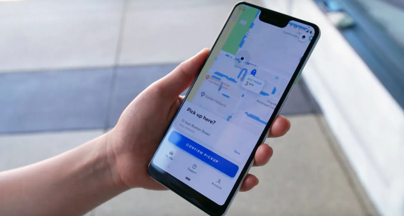
The first point of contact with Waymo is when you open the app to order a car. The home screen shows your location on a map and is meant for choosing a pickup point. Here the designers at Waymo immediately ran into an interesting problem. When ordering a Lyft or Uber, you don’t have to be super precise when choosing a pickup point because A, you will make contact with the driver by flagging the car down. And B, the driver will momentarily slow down to let you in even if parking is not allowed. These are two points that are not possible with autonomous cars. There is no human driver to communicate with, and self-driving cars won’t be able to operate in this grey area of the law that allows them to stop in illegal places for brief moments.
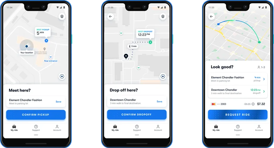
Instead, the app suggests pickup points by marking in blue the areas on the map where the car can safely pullover to let passengers in. If the pickup point is not good enough, you can drag it, and it will snap to a more convenient spot. The same has to be done for the drop-off point. This way, Waymo gives passengers a sense of control, which helps to set the right expectations and build trust with the automated system.
Design of the Car
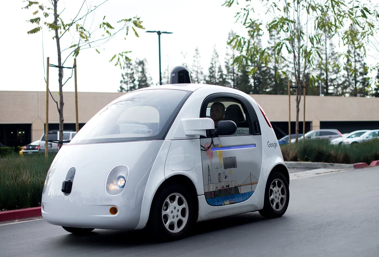
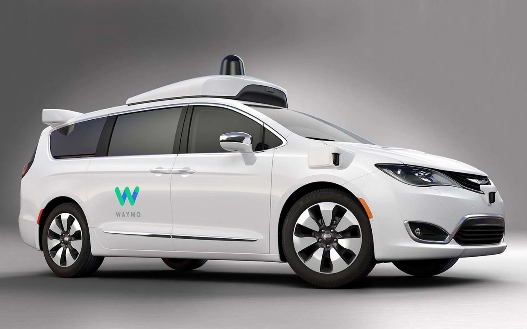
Next, the vehicle arrives. It can be a strange and unnerving experience to see a car coming towards you without a driver. Again, taking away uncertainty is essential here, not only for the passengers but for all other road users who interact with the vehicle. People tend to anthropomorphize cars, so the way the car looks can help in this process. Waymo uses a fleet of Chrysler Pacificas, so there is not a lot of freedom to change the design of the car. Although with the Google Firefly project, the predecessor of Waymo, they have shown what they think a self-driving car should look like, which is friendly and approachable (quite the opposite of most modern cars…).
But what Waymo can control on the Paificas are details like the color of the vehicle, which is white, a clean and innocent color, and the design of the sensors, which is simple and not very sophisticated. It has a resemblance to early Apple products that also aimed to look like home appliances instead of industrial machines.
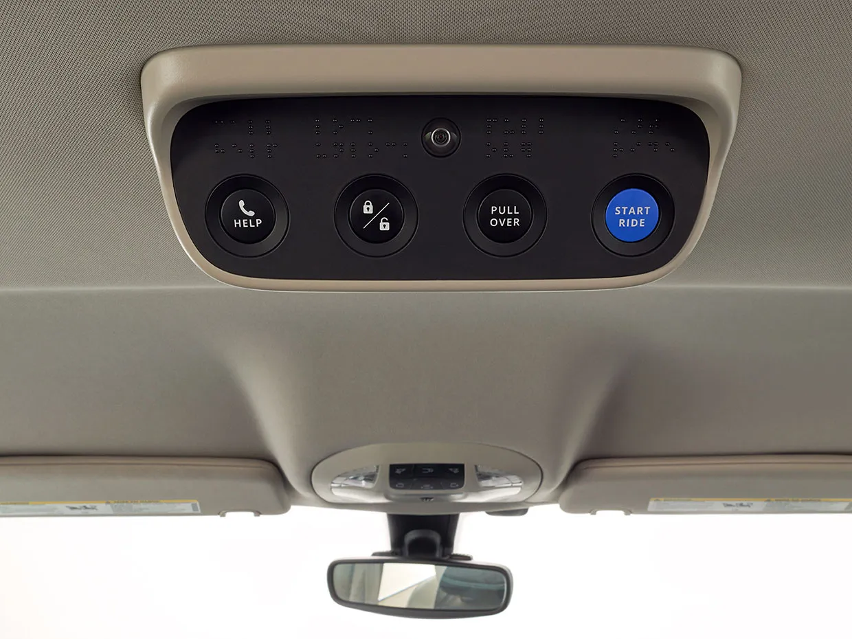
On the inside, the vehicle has not changed much. There are two screens mounted on the headrests that provide information to the passengers. Also, a physical panel with buttons is attached to the ceiling which is there to give a sense of control to the people in the car. The ride will only start when they press the start button. They can talk to a human customer support agent at any point, and there is a ‘pullover’ button that allows passengers to stop the ride at any point. It is rarely used, but just having the button already gives a sense of control.
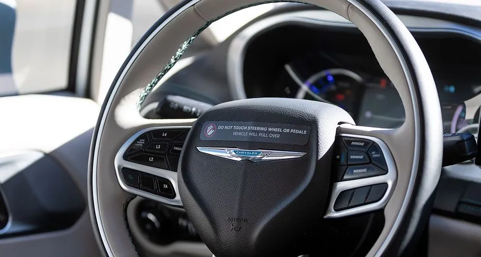
A fun touch is that there is a sticker on the steering wheel that warns not to touch it because it will stop the car — the opposite of what happens in current semi-autonomous production cars.
The Ride
The ride itself is the most crucial part of the experience. Being the first to offer self-driving cars to consumers, public perception of driverless cars depends a lot on Waymo. This is reflected in the friendly and approachable look of the vehicles. But also in the driving behavior, which is cautious, it will keep a considerable distance to the car in front, it will brake early for traffic lights, etc. Most users will find the experience quite dull after one or two rides.
The designers at Waymo found out that communication between driver and passenger is essential and should be replicated in self-driving cars. They identified two types of communication that happen between passengers and drivers: direct and indirect. Direct communication occurs when passengers ask questions like “how long does it take until we arrive?” or “why are we taking this way instead of another?”. Indirect communication is mainly nonverbal behavior like when the passenger checks to see if the driver noticed pedestrians trying to cross, or checks how the drivers’ hands are positioned on the steering wheel.
Recreating these two types of communication between passengers and driverless cars is essential to build trust. So how do you do this?
Visual Communication
The most prominent channel of communication happens via the two screens mounted on the headrests. Waymo’s engineers developed a tool that uses the camera feeds of the car to highlight what the sensors on the vehicle are seeing. Of course, the view of the engineers is too detailed and technical. But the designers used this as a basis for communicating with the passengers in the car.
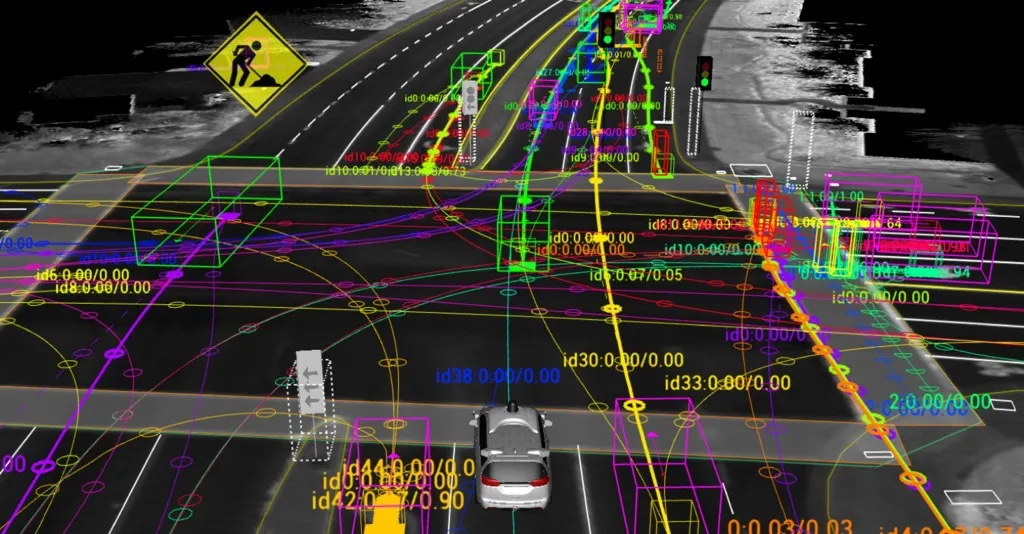
Because the engineers’ view is too elaborate, it raises an interesting question: what information do passengers need and how detailed should it be?
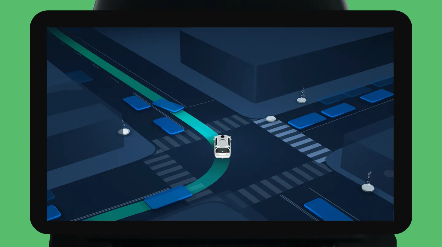
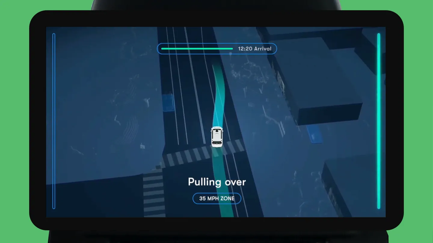
In order not to overload passengers, only the essential information is displayed. First of all, the feed from the cameras is turned into an abstract animated map. The map consists of just two colors: dark blue for roads and light blue for the rest. More detail is not necessary. The most important information is the route, which is displayed in a contrasting green color. The blue and green were chosen because they have a calming effect on passengers and because they are the brand colors of Waymo.
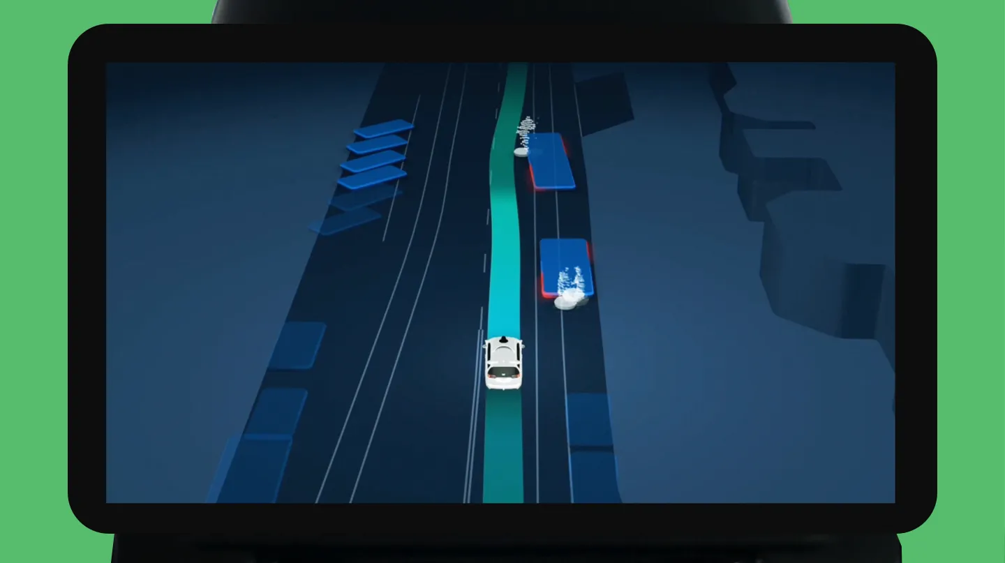
Other necessary objects are crosswalks, traffic lights, and other traffic signs that impact the drive. As a passenger, it is comforting to know that the car can interpret these signs, so they are shown on the displays. The last piece of information that is shown are the other road users. There is a difference between vehicles, which are represented by abstract shapes, and pedestrians and cyclists. The latter are visualized in a more detailed way through the laser points of the sensor. As a result, they appear very human-like because you can see the movement of the arms and legs. The interface also makes a distinction between pedestrians and cyclists via a different colored shadow. Representing pedestrians at this level of detail might seem a bit too much, but that is the point. By showing how much the car can see, the passengers will trust it more easily.
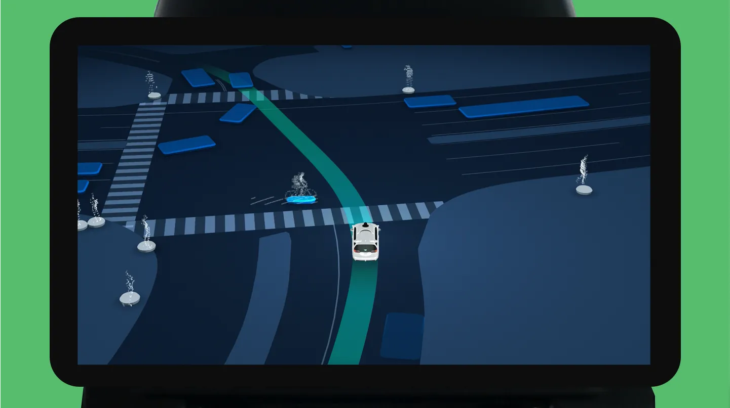
Another type of information shown on the map are buildings. This is done just to give more context to the passengers, but since it is not vital, they are visualized in abstract shapes, just like the other vehicles.
While driving, many unplanned events can happen. Think of construction work, or emergency vehicles racing through a city. In normal scenarios, as a passenger, you would have a look at your driver to confirm that he has spotted the event and will act accordingly. This small interaction is needed in autonomous cars because these events can be extra stressful if there is no driver. The Waymo interface solves this by showing these events extra detailed. For example, when encountering a closed lane with traffic cones, the interface will highlight the exact number and position of the cones. One glance on the screen will confirm that the car has noticed the event and is capable of responding to the situation. Emergency vehicles are shown like other vehicles, but they have flashing lights to make the distinction.

Another example of a situation where you would typically communicate indirectly with your driver is when the car is stopped, and you don’t know why. By checking where the driver is looking, you can find out why the vehicle is stopped. For example, the driver might be waiting for a traffic light, or for pedestrians to cross. Waymo solves this by highlighting the event that the car is stopped for. In the case below, pedestrians are waiting to pass, so the crossing lights up.
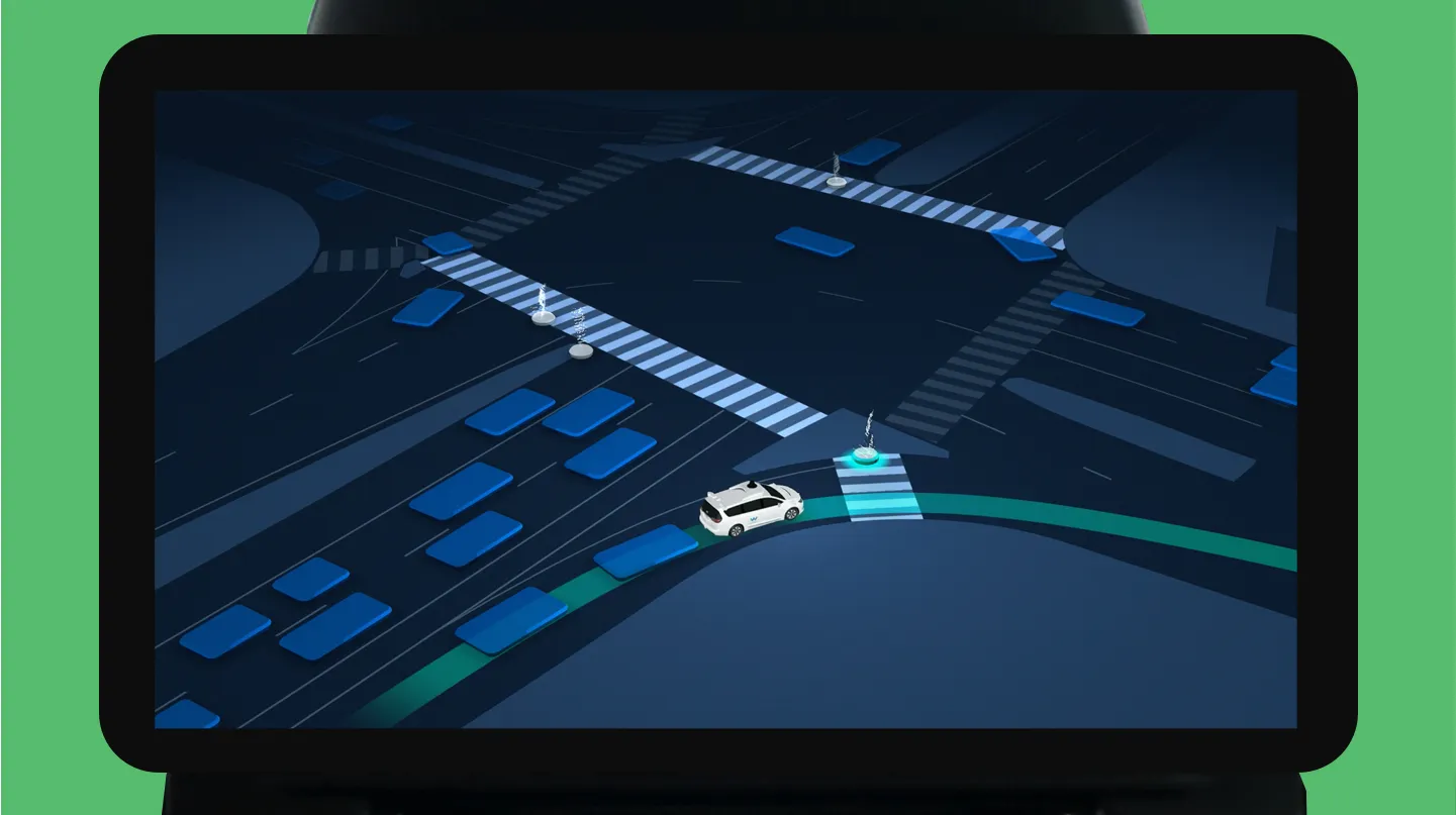
Another fun touch is that when taking turns like this, the camera angle changes to show the area where a human driver would usually look to see what is coming.
As an additional sense of confirmation, there is a periodic pulse going through the interface that shows the laser points and detailed surroundings of the car. As mentioned before, this is to demonstrate that the vehicle is sensing much more than it displays.
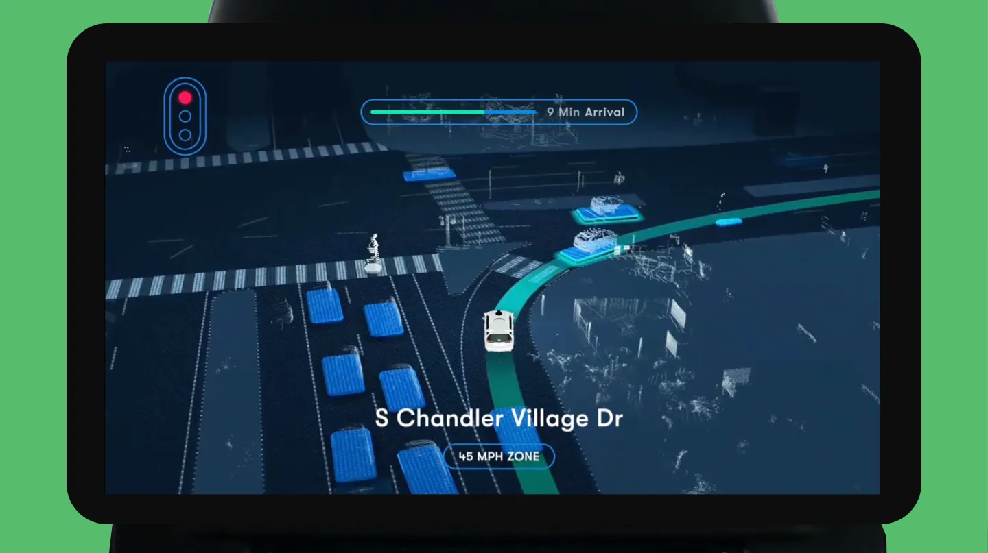
On top of this 3D map view, the interface has a 2D status layer with more detailed information about the decisions of the car and the progress of the ride. For example, it shows the name of the street or the color of the traffic light.
It can also highlight what the car is doing at the moment. In the example where the vehicle is stopped to let a pedestrian cross, the 2D layer will highlight this.
Sound Design
Not all information is passed on to the user visually. Waymo wants the passengers to sit back and enjoy the ride. The display serves as a way to quickly check the status or new information. Even more, it is very likely that the passengers will engage in conversation, play music, or, most likely, be on their phone. If some vital information needs to be communicated to the passenger, a screen alone will not suffice. Therefore, the designers at Waymo use audio to engage people at critical moments.
As with visual information, while using sound, it is essential to find the right balance. You don’t want to annoy passengers in the car, but you don’t want them to miss an important notification.
There are two different types of audio communication. First, there is an urgent notification which requires the passengers’ attention to the screen. For this, different sounds and chimes are created. These sounds are set in E-major, which is associated with joyfulness and pleasure. This key was chosen because it is also a way to communicate the brand, and Waymo wants to be associated with joy. Groups of different sounds are designed to be related to each other. For example, the sound played at the start of the ride is very similar to the sound signifying the end of a trip. Ultimately, users will learn this sound vocabulary.
For more complex information, voice is used. For example, when entering the car and setting off, as a user, you might not be looking at the screen or not figuring out the interface immediately, so a pleasant voice says the destination when the car sets off. Also, when arriving, since there is no human driver, the voice takes over some of these tasks, like announcing the arrival and reminding not to forget anything in the car.
Another way sound is used is to comfort people when they enter the car. For many, it is the first time they use such technology, and even though the screen should provide all necessary information, the use of ambient sound helps to feel more at ease (link).
Sound also has a secondary use case. Self-driving cars have the potential to give more freedom and independence to people with disabilities. The Waymo team is looking into different ways they can help disabled people to use their service. For example, there are unique features aimed at visually impaired users. They can remotely honk the car when it arrives. And in the car, the physical panel with buttons has labels in Braille and supplements the essential features of the touch screen. Voice and sound supplement the essential communication of the touch screen so visually impaired users will be able to enjoy the ride without relying on help.
When the car arrives, the map changes to a top view of the car with a walking route to the final destination.
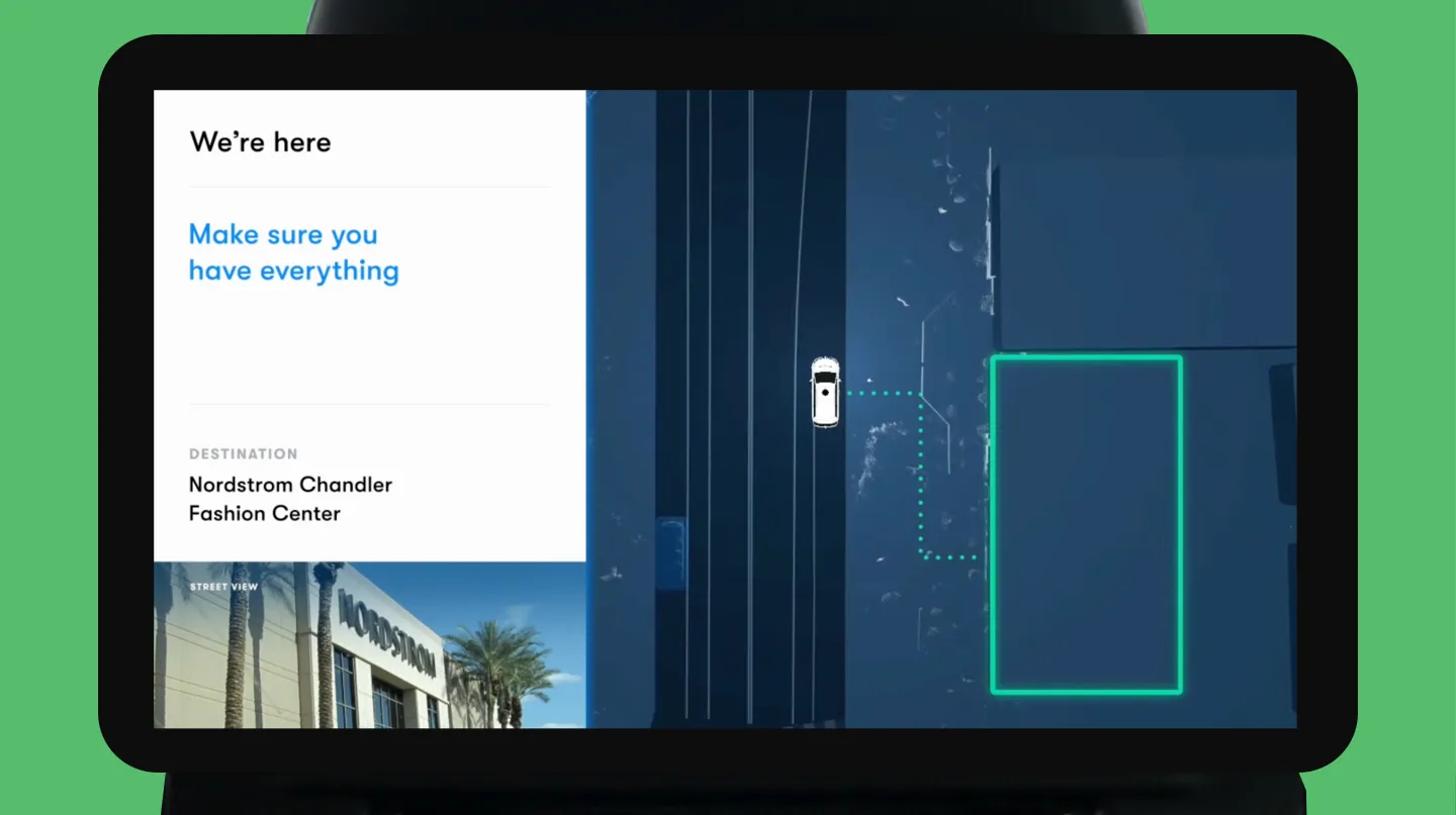
It is a nice detail because a trip does not end when the vehicle arrives, but when the passenger reaches the destination. It signifies Waymo’s focus on the complete ride experience, not isolated interfaces. The interaction with Waymo starts when opening the app for the first time and ends when you arrive. In-between, Waymo builds trust and communicate their brand via visual communication, sound, and physical design. It is an excellent case of service design and an example for the automotive industry.
Sources
All of the information in this article came from a couple of talks and articles about Waymo Design. For more details, check out the most interesting ones below.
Youtube (link, link)
SXSW Talk (link)
Waymo blog (link)
Google Design (link)
Get notified of new posts
Don't worry, I won't spam you with anything else