

Since the arrival of the first iPhone, designers at car companies have tried to copy its minimalist look and interface in the interiors of cars. With every new generation, more physical buttons and knobs get ditched in favor of giant touch screens. But while iOS is specially designed for scenarios where people use smartphones, the touch screens in cars just seem to copy the design instead of appropriating it to driving scenarios. This makes these touch screens too complex to operate while driving. As a result, distraction-related accidents are increasing every year. So I asked myself the question: is it possible to create a modern interaction model that allows the flexibility of touch screens but does not cause driver distraction?
Studying the Interactions
When thinking about how to reduce driver distraction, I think it is often approached from the wrong side. When an interface has a lot of features and is difficult to understand, the answer is not to make the interface easier, but to limit the number of features. This leads to the following question: should drivers do whatever they want in the infotainment system, or should designers limit what people can do in cars for the sake of safety? To me, it is obvious that drivers should be limited by design. Though it is not just as simple as removing all the features from a car. The car industry is insanely competitive, so consumers will still buy the car with the coolest features. So how can we remove a lot of distractions from the cockpit, while still offering a product that consumers want?
If we look at the kind of interactions drivers have with these devices we can categorize them as the following: basic, and complex. Basic interactions are those like changing the temperature, the volume, checking the fuel, etc. They don’t cause a lot of cognitive load, they are performed often, they should be easily available at all times, and they are required while driving. Complex interactions are those like changing the settings of the car, planning a route, finding a gas station, etc. They can cause a lot of cognitive load, they take a long time to complete, and no matter how good the design of the interface is, they will always be distracting.
I want to create a concept that, while driving, makes it easier to access the basic interactions. Next to that, I want to find a new solution to facilitate the complex interactions. As an extra requirement, I imagined that this concept should be able to be realized within two years. I did this so that I can’t get lazy and rely too much on future technologies which are difficult to predict.
Basic interactions
After splitting the interactions into two categories, it is time to look at the basic interactions and research where to place the information, and how to manipulate it.
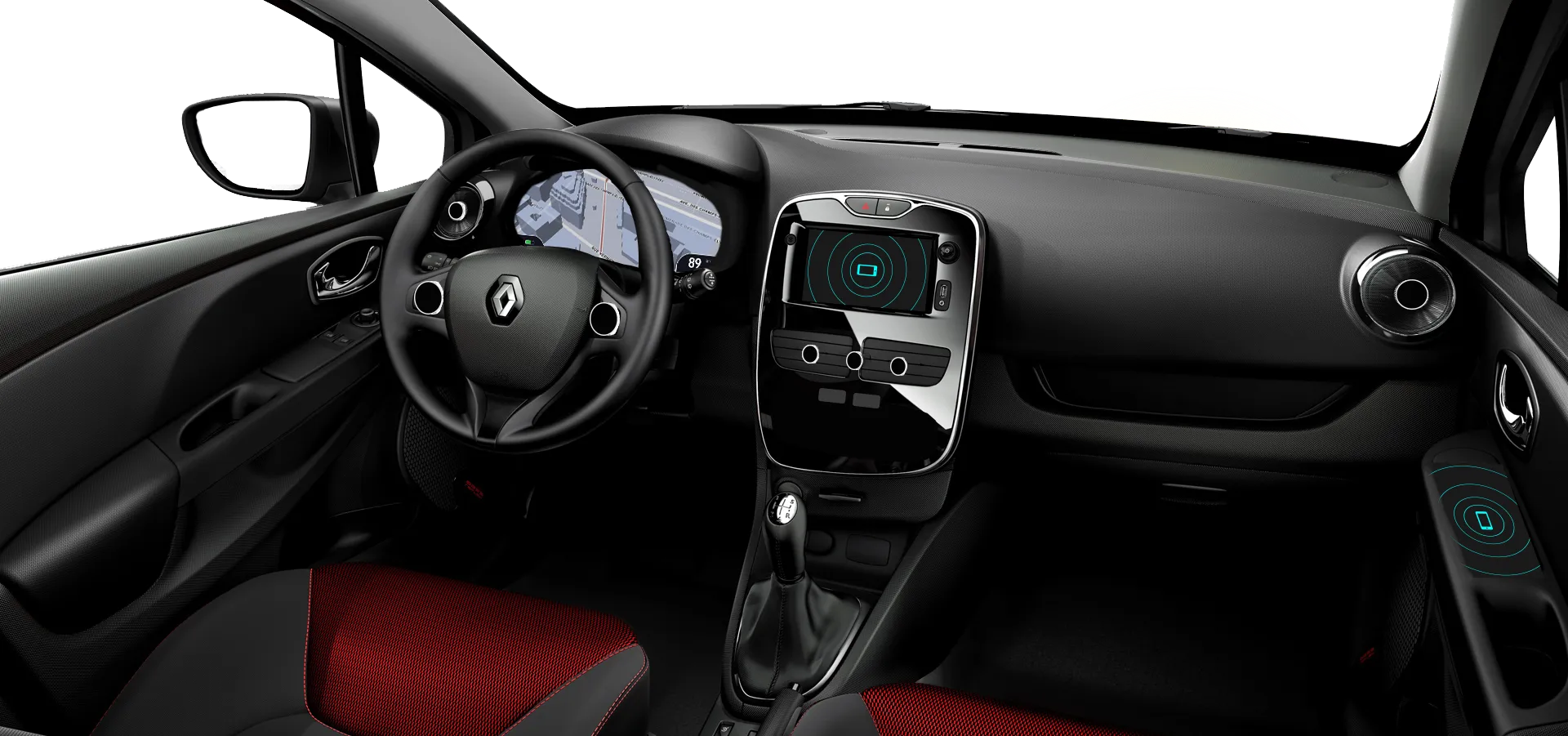
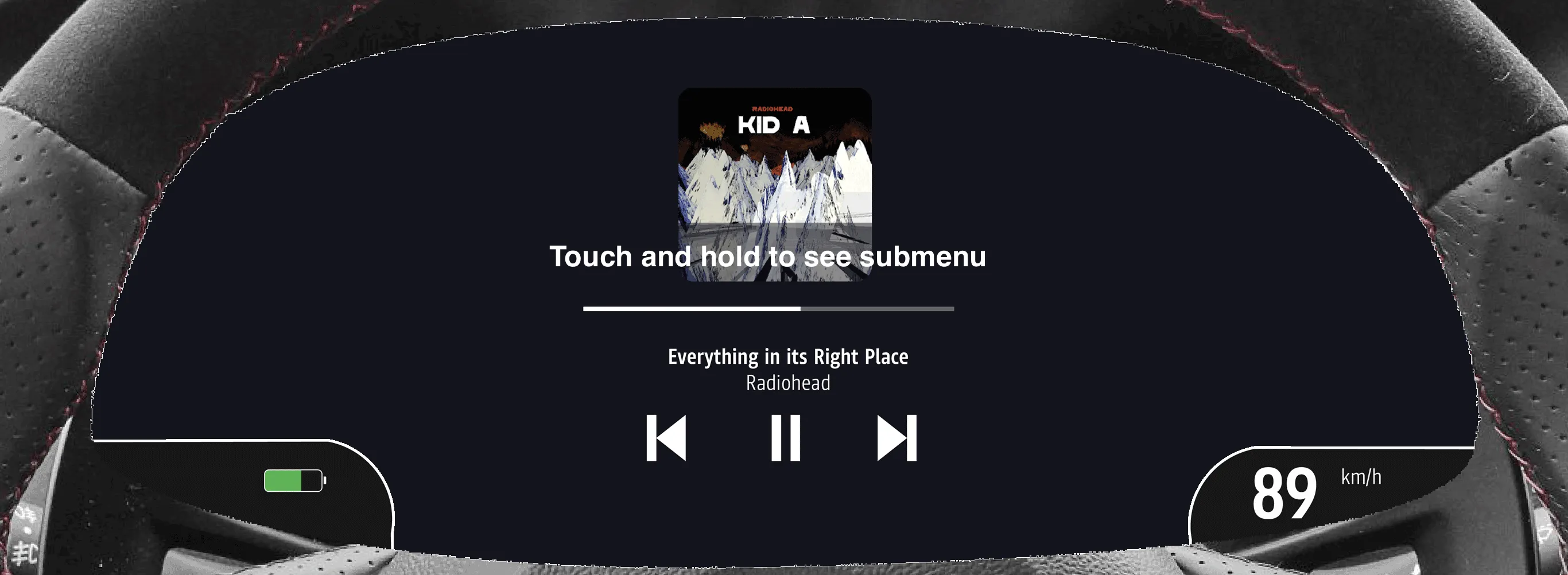
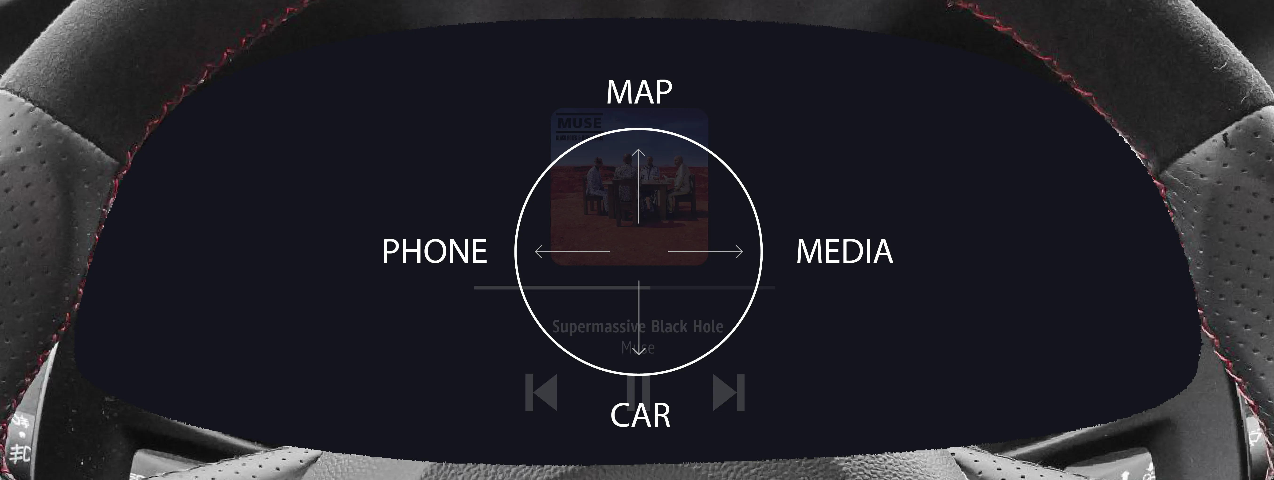
Research is pretty clear on the fact that driver glance should be minimized so the visual information should be placed as close to the driver’s line of sight as possible. I chose to use the instrument cluster for his because of the relatively high complexity of the information. Alternatively, I considered solutions with head-up displays but those would have the opposite effect due to the high complexity of the information.
Second, and most importantly, how to manipulate this information? The basic interactions will be done very often and should be as least distracting as possible. Research in the field of human-computer interaction on automotive applications has been growing in the past years. Multiple pieces of research have shown promising results considering new types of interaction that allow more direct manipulation and less distraction. I found some promising researches that experimented with using gesture interaction on the steering wheel. It has two great advantages: it allows for much more complex interactions while keeping the hands on the steering wheel. Second, the Pareto principle can be applied to the basic interactions. So 20% of the interactions will be done 80% of the time. By using gestures, drivers can be trained to use muscle memory to interact with the cluster screen over time which reduces distraction.
After diving through all of the relevant research that I found, I came up with a concept that has two touchpads on the steering wheel close to the driver’s thumbs. The driver can operate the cluster through gestures like swiping, pinching, and tapping. For the interface, I opted to use a very basic, menu-based layout. I considered scenarios where the interface would also be totally different but this did not fit in the scope of the project and would shift the focus away from exploring a new type of interaction towards interface design.
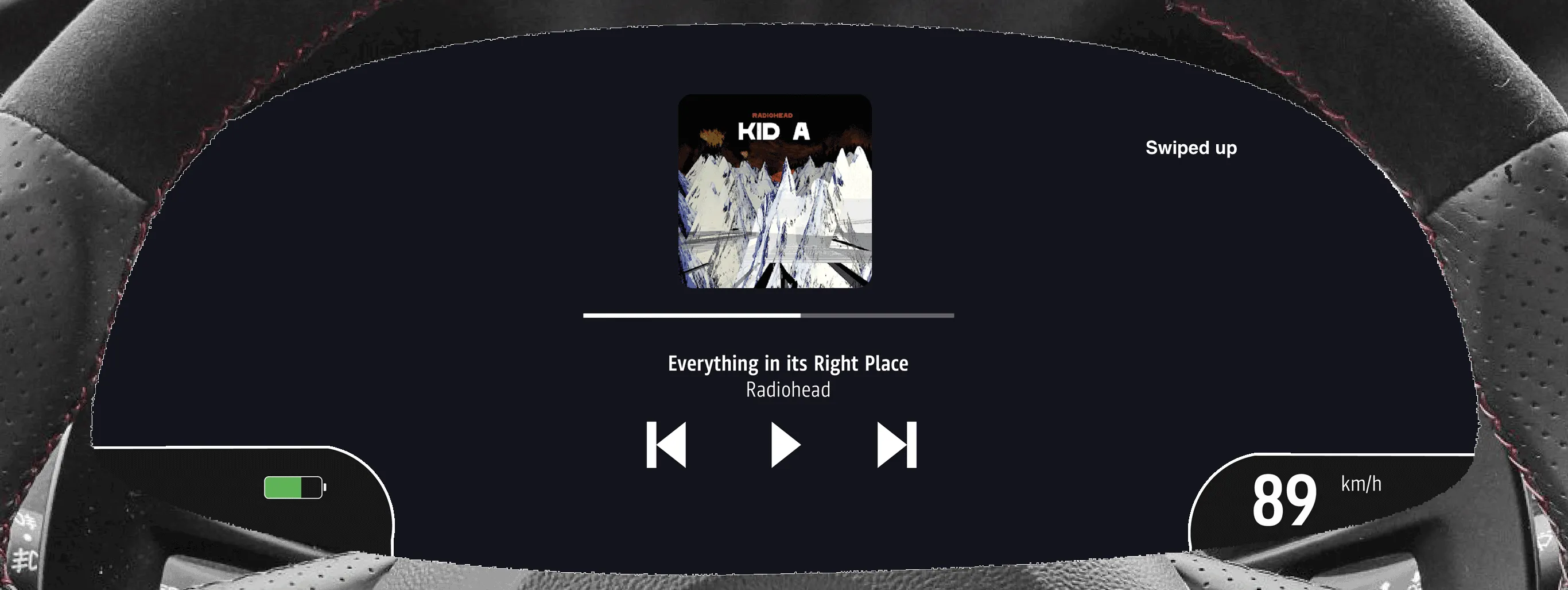
To navigate through the menus, the user can swipe in 4 directions: up, down, left, and right. Each direction corresponds to a setting or function. The left touchpad controls the main apps of the system. It is used for switching between media, navigation, car settings, and phone. The right touchpad controls the submenu of each app.
The main problem with using gestures is discoverability because the touchpads do not display anything to prevent distraction. How can users discover how to use the system if the interface is hidden? To solve this problem, the system detects when a user is hesitant and shows a digital representation of the menu that teaches the user how to operate the system.
After some time, the driver will create muscle memory for the interactions that are done very often. At that point, he can operate the system without the need of a user interface.
Next to the 4-directional swipes, custom gestures can be used. The great advantage of custom gestures is that they allow users to define their own gesture for a specific interaction they often do. For example, when a user sends a message every time he leaves work to go home, he can set up a custom gesture so that with one action, he can do something that would otherwise take 5 actions or more.
If a user starts a custom gesture but does not know how to finish it, the same principle applies as before. After the system detects the user is hesitating, the interface shows how to finish the gesture with a graphical representation of the gesture on the cluster. The system will show which gestures the user can execute from the point where he got stuck.
By default, the system only has the bare minimum of gestures to keep it simple. In the current concept, there are only essential gestures, like the 4-directional menu navigation, and basic custom gestures like a ‘check’ and ‘x’ gesture for approving and canceling respectively. But since users can set up their own custom gestures and choose exactly what they control, they can appropriate the system to their own needs and uses. An expert user can choose to set up as many gestures as he wants.
Gestures are powerful and can be used for a lot of scenarios. I explored how far you can go with gestures, for instance, to set up the navigation:
But I found it too distracting to do a big interaction like that with gestures. To reduce driver distraction, it is important to keep them as simple as possible. So next to gestures, the driver can also interact via voice command. The voice command works especially well when executing complicated interactions like filling in a destination in the navigation system. Ideally, gestures and voice command are used interchangeably. For example, the user can do a gesture to go to the navigation app, and use his voice to say the destination.
Complex Interactions
We have covered the basic interactions, now let’s look at the complex ones. These are interactions that happen occasionally but are not crucial when driving. Today, all of these interactions are facilitated in some form in the dashboard, mostly on a large touch screen. Apart from some exceptions, most of these screens are far from the well-designed, fast tablets that we are used to. The problem here is that, next to the poor speed and quality of the screens, people are used to one or two different operating systems. Their smartphone, and their computer. Then, when they enter their car, they are presented with an entirely new operating system. And when someone enters the car, they are thinking about going from A to B, and not about learning the operating system of the car. So no matter how simple the interface is, people will not master it. This also explains the popularity of Apple CarPlay and Android Auto which projects a familiar interface from the phone to the infotainment screen.
The ideal solution would be to move the complex interactions out of the car entirely since they are too distracting while driving. And since people are only used to the operating system on their phones and computers, why not offer the interaction on their preferred devices? So I tried to facilitate this in such a way that would not burden the user.
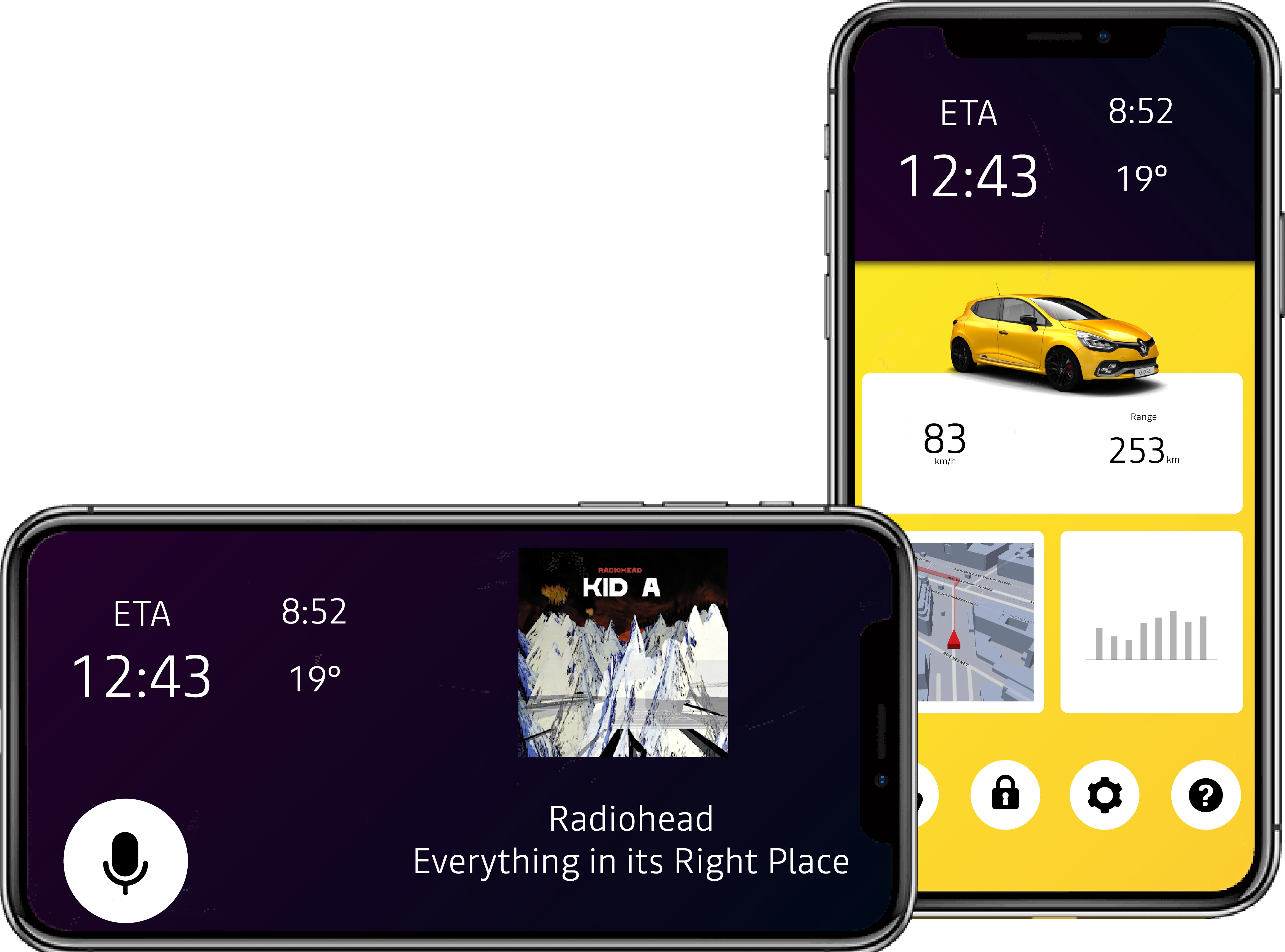
The concept I propose is to move the entire infotainment system from the car to an online environment that can be accessed from any device. If the driver wants to change the car’s settings, set up a route in the navigation, install apps, etc. he can do this on his laptop, tablet, or smartphone, from his couch and send the information to the car. The cluster provides access to only a subset of the infotainment system.
In the car, you only have access to the basic interactions. This is limiting to the user in some scenarios so it is appealing to the driver to pull out the smartphone and play with the app while driving. Therefore it is not only important to design around the smartphone from a software perspective, but in the physical world as well. The design should prevent the driver from using the system while driving. For each passenger in the car, including the driver, there is a designated area for placing the smartphone. These areas provide wireless charging and are also the points where the connection between the car and the smartphone is made. This means that anyone can interact with the car via his smartphone. So when two people are in the car and the driver is looking for a petrol station, he can ask the passenger to help out and send the updated route to the car. The same goes for media, settings, messages, etc.
As explained before, to reduce driver glance, most information is presented on the cluster, right under the focus of the driver’s eyes. This is beneficial to the driver, but not to the passengers who are missing a central display with information about music, navigation, etc. Therefore, there is a main phone connection area in the center console. The difference between the ‘main access area’ and a regular phone area is that this is the only spot that is in reach of the driver so placing the phone there will restrict the usage of it completely to the people in the car. It will display essential information to the driver and passengers like the current media that is playing, the time, and ETA. The only interaction with the smartphone that is possible is a voice command. Even when the phone is taken off the spot, while driving, the application will not allow any input from the driver to prevent distraction.
Here is a small scenario to make it more clear. Imagine that you need to go on a long drive tomorrow. In the evening, you open Google Maps, plan the route, and send it to the car. It will probably be hot when you leave so you plan to turn on the climate control 5 minutes before you leave so that you have a cool car. Also, you already queue a podcast that you want to listen to while you drive. The next day, your phone reminds you that there is traffic and sends a warning in time to leave earlier. When you get in your car, you place your phone in the center console and you are good to go.
Validating the Concept
I just proposed a huge new concept full of researched hypotheses. It is time to test if it actually works. The concept is so broad that I focused on one very specific part which is the gesture interaction. More specifically, the discoverability of the gestures and if users can become expert users because those are my main concerns of the concept. By expert users, I mean that they can use the system without the help of the interface.
I created a prototype of the basic interactions in JavaScript using the 1$ Unistroke Recognizer. I used an iPad Pro to test it since it is about the size of a steering wheel.
I developed a test scenario that went from small objectives like “pause the song”, to very broad instructions like “reply to a message that you just received”. So it gradually introduced participants to the concept with increasingly difficult goals. To test the discoverability, I gave the iPad to the participants without any explanation about the concept.
User Tests
First, I did a very basic test with 4 other UX designers to weed out any core issues. The results of the test lead to some minor changes to the interface that gave more help and feedback to the user.
The second user test was done with 14 participants who had no previous knowledge about the project. It was tested with 6 UX designers and 8 participants with no background in design or technology.
Check the video for the prototype:
The results are promising. When the participants were presented with the prototype, they didn’t need much time to figure out how the system worked. Most of the participants learned to use the system very quickly after trying to perform the first or second task. Also, more than half of the participants figured out the ‘expert mode’ on their own and used the system without the interface quite quickly.
Most of the participants did need help at some point of the test to complete certain tasks. One big reason is the reliability of the software. In many of the cases, a false positive was detected by the system which confused the participants from the start and put them on the wrong path. Also, some of the gestures were not intuitive. For example, many participants tapped the touchpads to pause the song instead of swiping. Based on these cases, two main points of improvement are suggested to ease the process for users: First, there should be a clear link between the touchpad and the interface that instructs the users what to do at each stage. Second, the instructions on the screen should be more demonstrative so that users understand more easily the type of interaction needed from their side: when and how to do a swipe gesture, and when and how to do a custom gesture. A great way to do this could be with an animation or a more descriptive icon.
Conclusion
The user tests have shown that gesture interaction shows a lot of promise for use in cars. The main disadvantage, the discoverability, is something that can be successfully designed for but more research is needed to determine if this concept is entirely valid. First of all, it would be interesting to test the suggested improvements to the interface. A logical next step would be to make a prototype in a real cockpit of a car and look at the interaction in depth in a driving scenario.
It is my personal opinion after the user tests that the gestures work really well but the interface with the menu structure is definitely not the right solution. Having two different menu layers is too complex for gestures only. For example, when a user is in the navigation app, to go to the next song, he has to swipe on each touchpad which is too much. It will be interesting to explore what kind of interfaces are can be used for this scenario.
On a broader level, this research has highlighted the need to move away from traditional interaction models towards different, more modern ones. In recent years, there’s been a significant increase in new technologies being incorporated into cockpits of cars. However, the interaction models remain the same. In a landscape where car startups are offering new user experiences in the car, where new business models are taking over, where major technology companies are moving into the car industry, and where cars are becoming more and more autonomous, the need for simple and effective user interaction is more important than ever. This concept explores the first steps in achieving that. This project was done at the design department of Renault. Many thanks go out to the team there for giving me the opportunity to do this project and help me along the way. If you want to read more about this project, you can find the full report here.
Get notified of new posts
Don't worry, I won't spam you with anything else