

When looking around in traffic, the number of people being distracted by their phones and infotainment systems is alarming. The latter is a problem entirely created by the car companies themselves. I think they are not doing enough to take ownership and address this. Having a well-designed user experience does not only lead to fewer accidents, but it also leads to happier customers, it is a win-win!
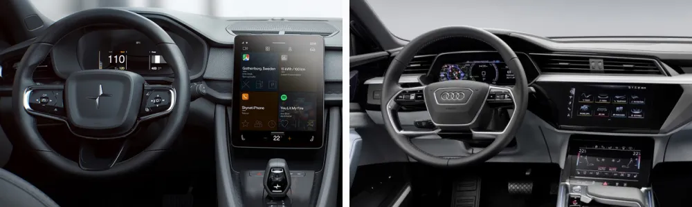
In short, either touch screens are a step back in usability from physical controls and a different solution has to be found, or there are significant improvements possible in the design. I decided to see if it is possible to create an in-car experience that has no physical controls and is usable at the same time.
Some Design Principles
Based on the core problems of touch screens, I came up with four abstract principles that help me to solve them.
1. “Simplify, then add lightness”
I had to look no further than the automotive world itself to describe the most important principle. Legendary race car designer Colin Chapman coined the famous phrase: “Simplify, then add lightness”. His race cars were successful in the ’60s because they were highly purpose-built and fully adapted to their context of use. This same principle is a determining factor in good interfaces.
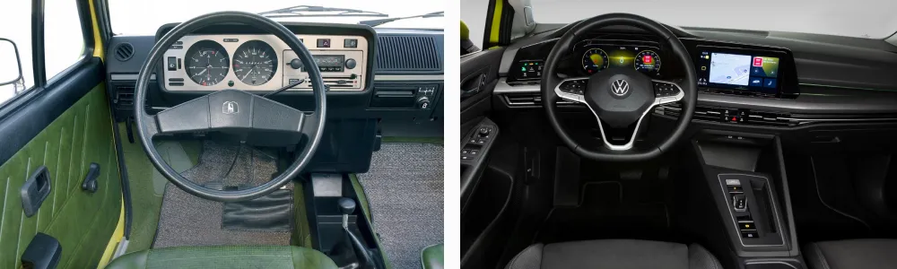
Compare the features in the interior of the Volkswagen Golf I to the Golf VIII. They are actually quite similar. Both offer some information related to driving, climate controls, and media controls. The main difference being that the Golf VIII has a navigation system. Still, how is it possible that the Golf VIII is so much more complex?
One reason is that it offers hundreds of additional options, features, and settings that are not essential. When digital interfaces became bigger and bigger, car companies saw it as an opportunity to add more features. But just because you can add something, doesn’t mean that you should. What I set out to do was reevaluate all these functionalities and remove anything that is not significantly contributing to the driver experience, and simplify the functionalities that do contribute. Which leads to the next principle.
2. Configuration vs Automation
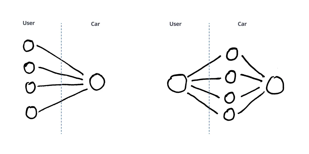
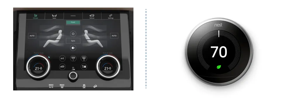
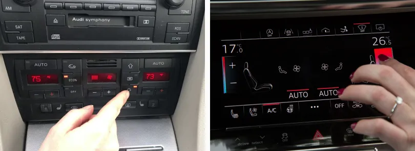
This abundance of choice is typical for the car industry. The more luxurious a car, the more options of personalization exist. Modern car interfaces reflect this. Users have a myriad of settings, widgets, backgrounds, colors, and more that can be configured in the interface. The same holds for other interactions like the climate controls.
Is it really luxurious to touch 5 different controls to get the temperature you want, or Do users appreciate this kind of luxury? Consider the example below. Isn’t luxury not having to interact with a system at all, or in a minimal way?
3. Adjust to Context
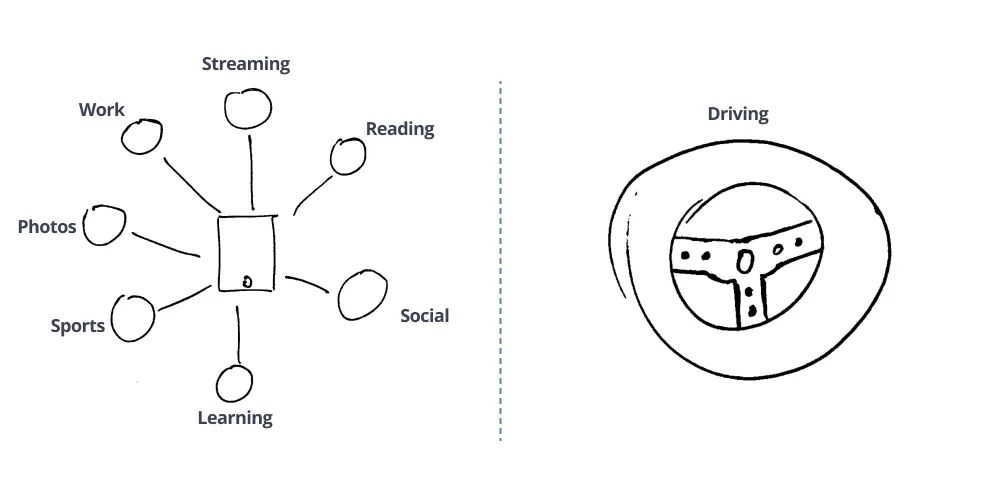
Today, most interfaces in cars are very similar to tablet interfaces. Tablets are devices that are used in a broad range of contexts. The interface has to work just as well when you are watching Netflix at home on your couch, as when you are multitasking in a busy office environment.
In a car, this is not the case. A UX designer can be sure that the interface will be only be used in a context related to driving. Therefore, they should design the interface to fit that context. It is the difference between a Swiss army knife and a chef’s knife. You can design the best Swiss army knife in the world, but in a kitchen, a chef’s knife will always be better.
4. Hardware Follows Software
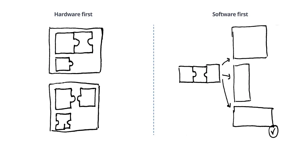
Designing a car interior is a complex process where different disciplines have to work together and compromise. Balancing usability with esthetics is important when thinking of screen layouts. But what if you did not have to care about the esthetics and could focus fully on usability?
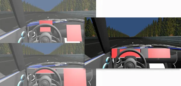
For this project, I did exactly that. I first figured out the core features of the interface. Then I tested the usability of different screen layouts by creating 3D models and testing them in VR. I discovered that a horizontal screen layout, close to the line of sight of the driver is best in terms of usability. With this in mind, I designed the interface without any real screen size constraint. I let the interface dictate the hardware size.
The Final Concept
In total, I designed three different versions of the concept. After each version, I sought out feedback from people in my network to improve it. Below is a mockup of the final concept.
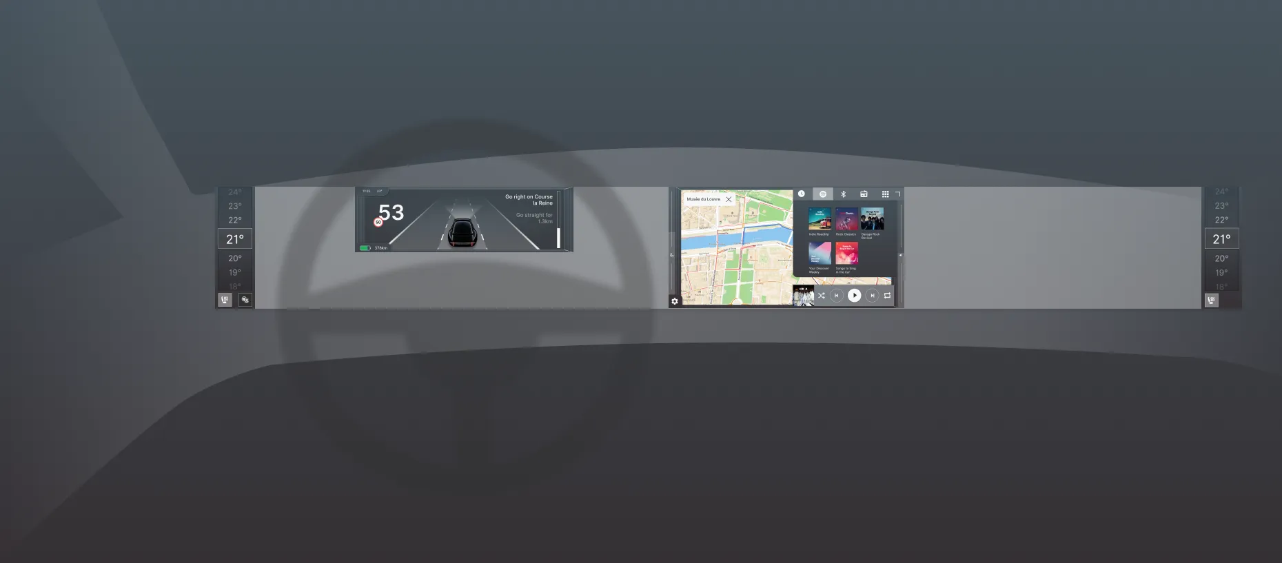
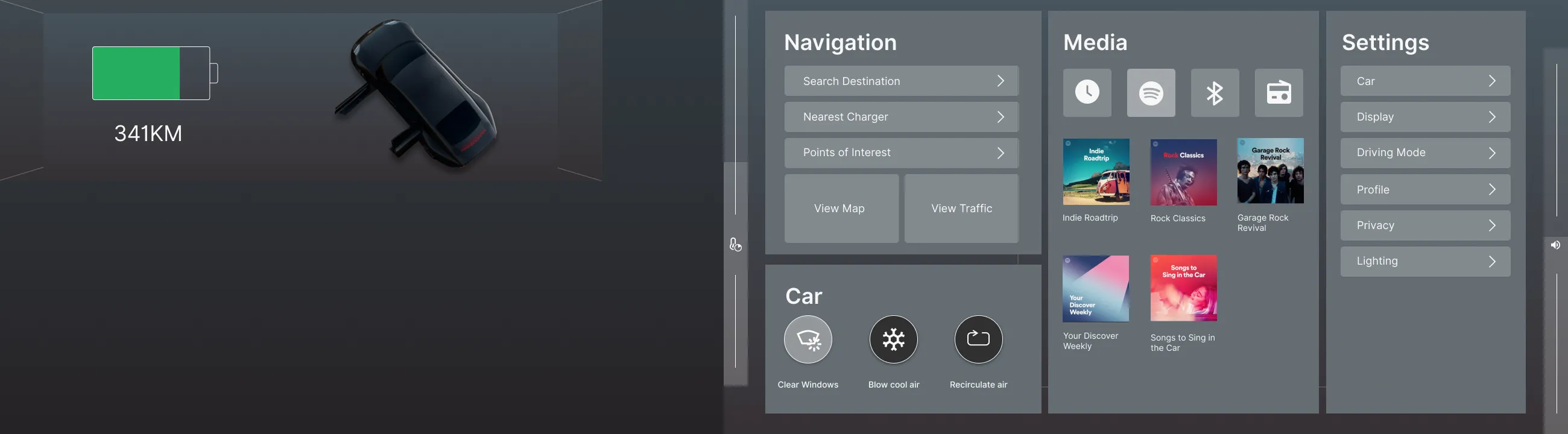
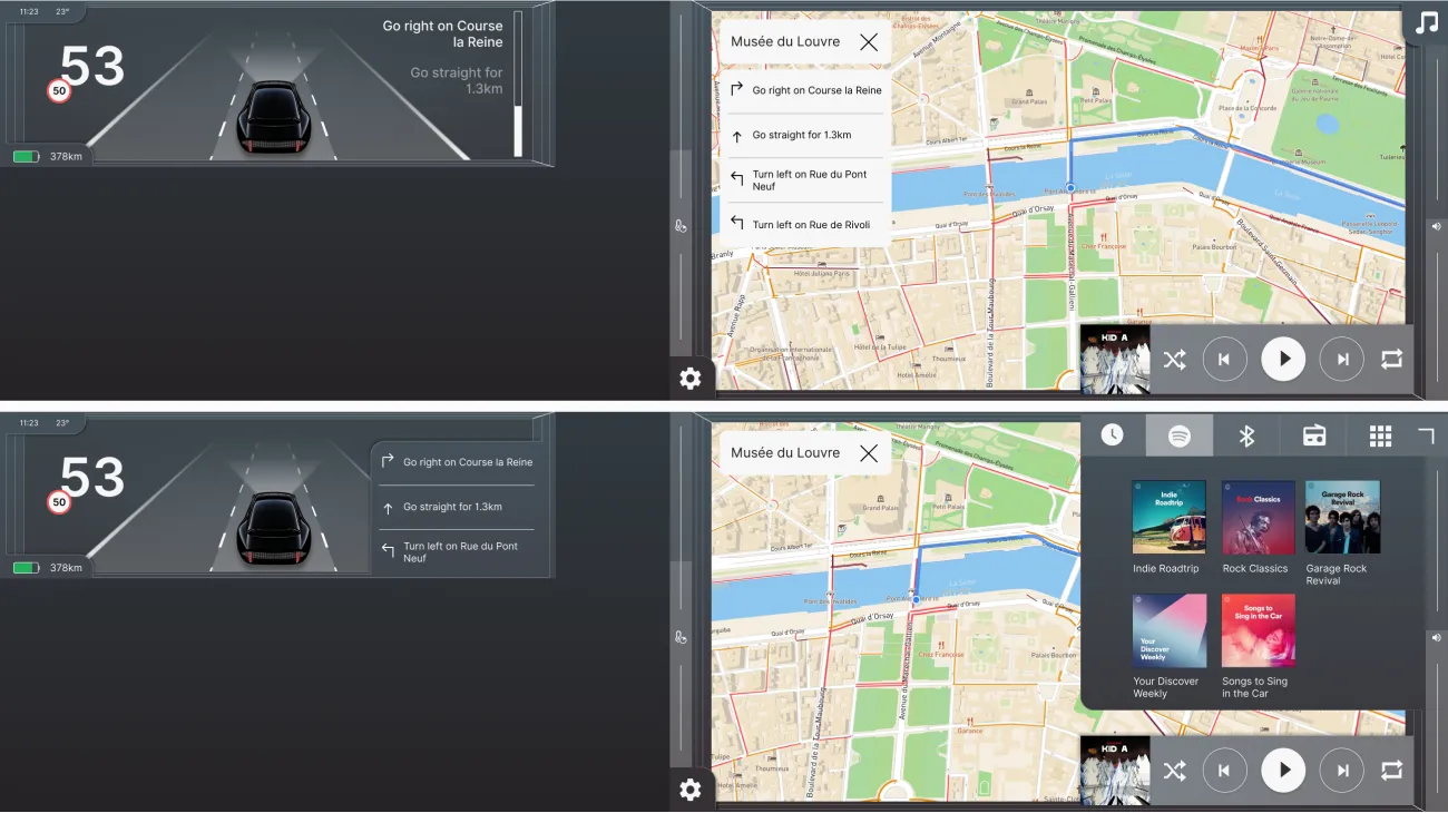
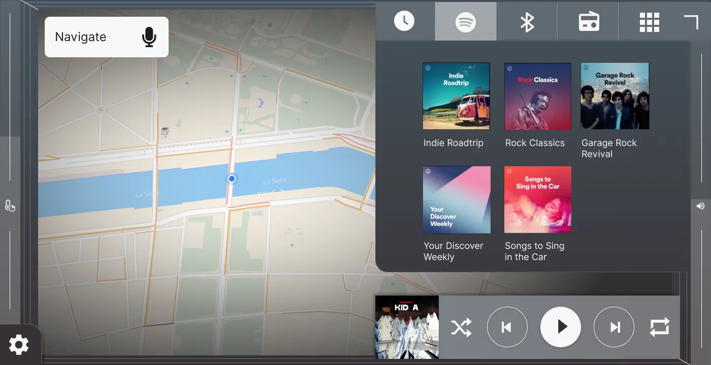
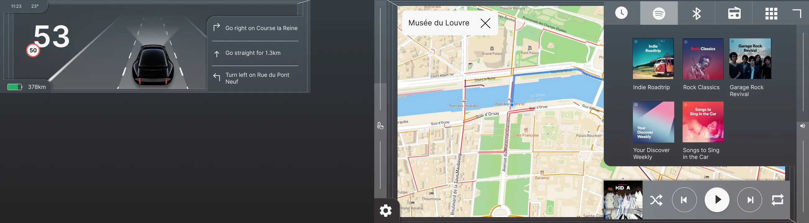
The interface is divided over four different screens. The center screen, the cluster screen, and the climate control screens. Let me take you through the main features!
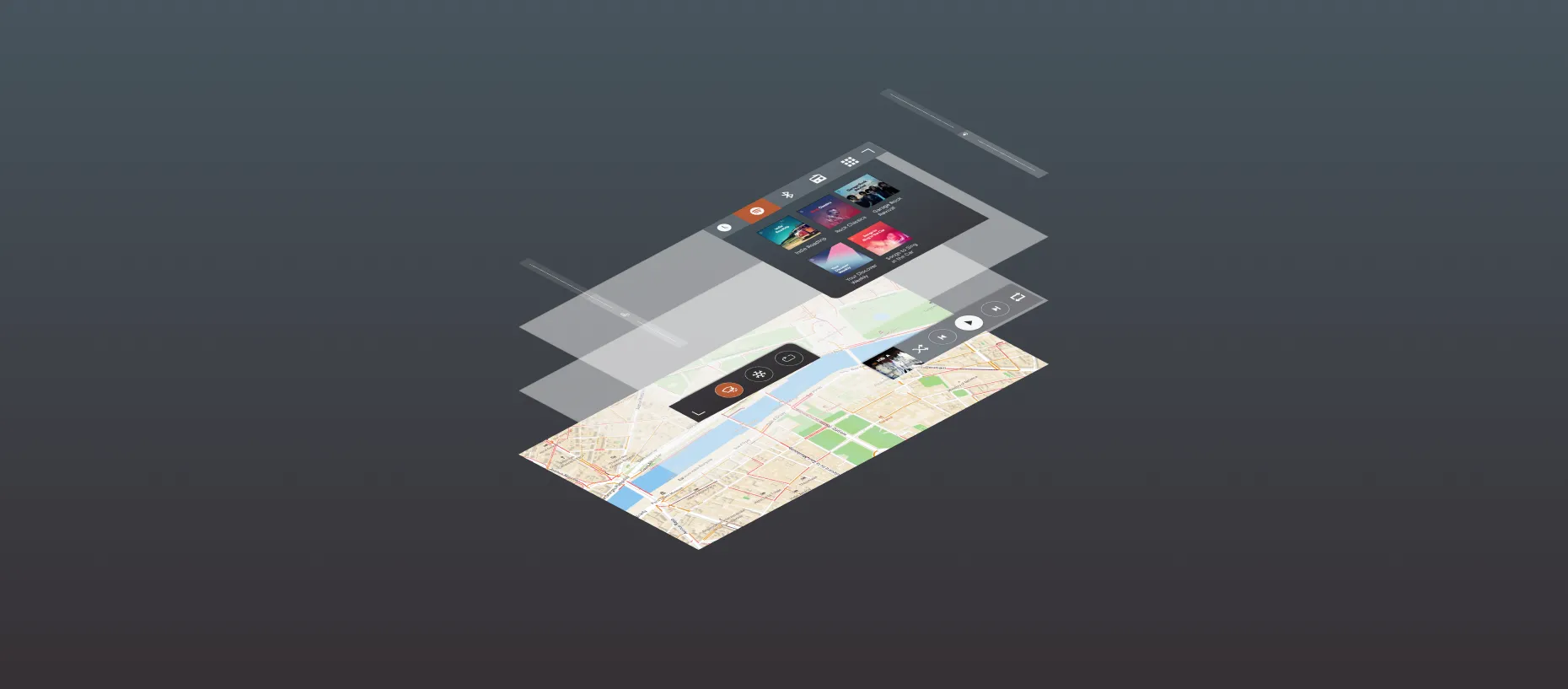
Layers
The center screen is the most important and I spent most of my time designing it.
When driving, almost all of the interactions are related to either navigation or media. Today, interfaces often give equal importance to other features like phone and settings. For simplicity’s sake, I chose to keep the interface as simple as possible and remove anything but media, navigation, and some basic climate controls.
These are organized in layers with the navigation as fundament. On top of that is the media player. These two will always be visible. One level higher are controls for climate and media which can be opened by clicking on the icon in the bottom left corner and top right corner of the screen respectively.
In a context where the user will be focused on driving, the time spent interacting with the screens should be minimized. That is why the placement of these elements is heavily influenced by Fitts’ law. It states that the time required to rapidly move to a target area is a function of the ratio between the distance to the target and the width of the target. In other words, to make navigation easier, you either place clickable elements close to each other, or you make the clickable area bigger.
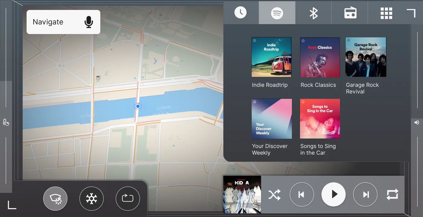
Fitts’ law also indicates that the most quickly accessed targets on any computer display are the four corners of the screen. It is much easier to blindly reach for a screen corner than an element placed in the middle of the screen. That is why climate and media can be accessed from the corners. Furthermore, on each side of the screen are more specific sliders for volume and climate which I will explain further on.
I made a conscious choice to place climate controls in the left half of the screen and media controls on the right half. Most cars have some form of physical controls on the steering wheel that control media and volume. Therefore, it is more important to place the climate controls close to the hands of the driver than media.
Driving Modes
The interface changes depending on context in two different ways. Park vs drive and short vs long drive.
Park vs Drive
First, there is a difference between the interface when the car is in park compared to when in drive. These two scenarios come with two different sets of user needs. When in park, all settings and features can be accessed. More importantly, the system closely resembles the typical recognizable tablet interface with small labels and buttons since distraction is not a problem.
But when the car is in drive, the interface changes. The driver is limited to functionalities only related to driving, like navigation and basic media controls. The labels and buttons are also much clearer and bigger so they can more easily be reached. This is a difficult choice to make as the system will not allow the driver (or passenger) to change any settings while driving. But in my eyes, it is a balance between safety and freedom to the user. And in that case, I choose safety.
Short vs Long Drives
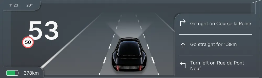
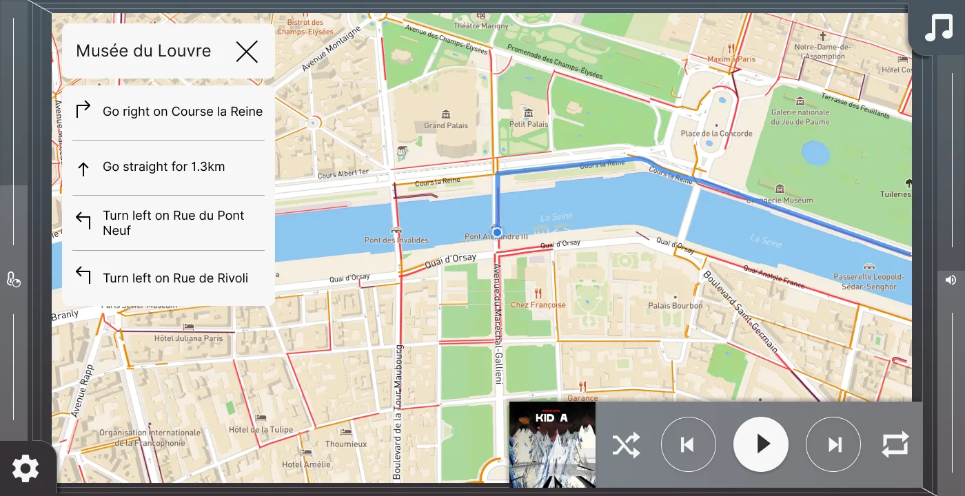
The second contextual change is the distinction between short drives and longer journeys with navigation. The main difference is in the map design. While out on a regular drive, say your daily commute, most users are not interested in many of the details on the map like street names, buildings, and more. The most important layer of information is traffic. That is why the map looks much calmer, and only shows the streets with traffic information on top. But when navigating, the map shows building shapes, major street names, highlighted spaces, and other features.
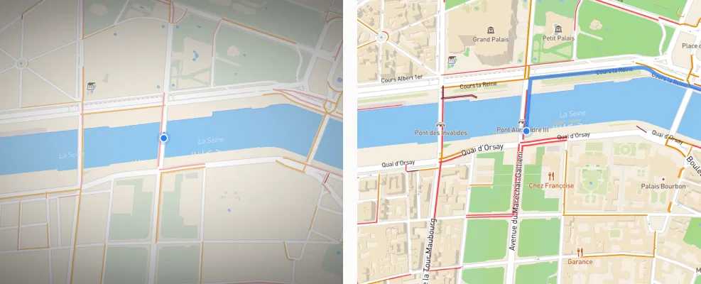
The other difference is the information displayed in the cluster. I wanted to explore how the cluster screen can work more closely together with the center screen to create a more holistic design. That is why the cluster screen shows information depending on the configuration of the center screen. As a result, the driver can choose between a big map with a calmer cluster, and showing the media screen with directions in the cluster.
Gesture control
Until now, I have not discussed the elephant in the room. The most heard complaint of touch screens is that in ‘old-fashioned’ cars you can reach for an important physical control and interact with it while keeping your eyes on the road. With current touch controls, this is not possible. The volume control is the most used example.
It is a valid complaint, but it is not as bad as some people make it seem. Most cars offer physical volume control buttons on the steering wheel, meaning that in most situations you can make small adjustments while not even taking your hands off the steering wheel.
But in some scenarios, this button interaction is not suitable for the action you want to do. Having the same type of interaction as buttons on a steering wheel but on a touch screen is not helping then. The good thing is that touch screens allow new kinds of interactions. After all, these screens run on software that we write and we can pretty much do with it as we want. It is sad to see though that car companies have resorted to mimicking the physical buttons on touch screens.
For most physical volume controls, rotary controls are used because they allow the user to change the value both in small incremental steps, and big steps, depending on how far it is rotated.
So when designing a similar control for a touch screen, the two requirements are: the controls should allow being reached blindly, and it should be possible to adjust it both in small and big steps.
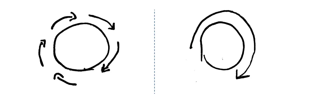
When reaching blindly for a control, you first move your hand in the general direction of the control and then use the sense of touch to reach it. Over time you built up muscle memory which makes the second step faster. This is not possible in touch screens because they are flat.
However, they do have edges and you can use your sense of touch to find the edges of a screen blindly. That is why I placed this type of control on both sides of the screen. By sliding your finger up and down, you control essential functions like volume. Slide slow for small steps and slide fast for big steps.
To make it easier, once you touch the slider area, it expands allowing for a big margin of horizontal error. Also, you can start the interaction at any vertical point on the slider which means that you don’t have to aim very accurately.
Climate Controls
As I have mentioned before, the principle of automation vs configuration applies most to the climate controls. Climate controls are interesting because they are largely the same in each car, but really complex. Most people only have a basic understanding of how to operate them. If you ask five people what is the best way to defog windows, you are likely to get five different answers (I tried).
Surely, there is an easier way to design them. If you take a few steps back and list the underlying goals of users when they interact with the climate controls, it mostly comes down to one: changing the temperature in the car. There are many different ways to achieve this, but cars are smart enough now to figure this out for the user.
That is why in this concept, the user only sets the temperature. The driver and passenger both have their own displays where they can set the temperature and toggle the seat and steering wheel heating.
Today, air-conditioning is often only touched to bring the car to a cool target temperature faster. For example, when your car was parked in the sun on a hot day. There is an argument to be made that with such an automated system, the car can control the temperature even when it is parked so that the temperature will always be exactly right.
But automated systems like these are never perfect. So there should be a way to overrule or nudge the system in a different direction. That is why there is a second control, the time to reach the target temperature. For this, the gesture control is used. When you enter your hot parked car, you want the car to cool down as quickly as possible when you enter. That is when you use the gesture input to set the preferred time to reach the target temperature.
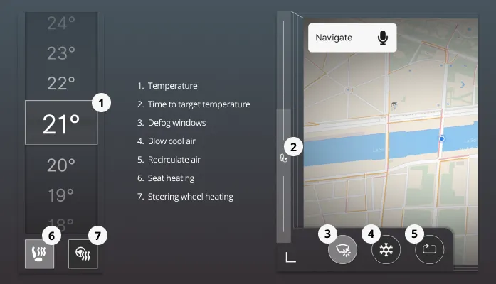
The temperature interface and gesture interaction should cover the essential interactions. The ones that should be within reach at all times. Additionally, there are three buttons placed in the left bottom corner for rarer use cases. The first is the ‘clear windows’ function that will use the various climate control ways to defog the windows in the car. The second is the cold air function that will blow cold hair into the cabin for a short period. This was added for the use case where you want to blow cold air in your face for comfort. The last one is the standard recirculate air button that you will find in most cars.
One of the reasons why climate controls in cars are so similar is that it is much easier for the user to use some form of standardized controls. There is an argument to be made that if the controls would be easy to operate, standardization would not be that important. But teaching users such a different system is difficult. So for my concept, the controls have descriptive labels on them when the car is in park. But user tests will have to be done to see how users perceive this.
Overview
What’s Next?
I designed this concept over the past few weeks. It went through three big iterations. I am currently writing down my process and all the design decisions that were made. So look out for that post!
A concept like this is never 100% done which is why I chose to post it now. Still in progress is the visual design, which is quite messy now. Also, the current concept is as basic as it can be. So it would be interesting to see what kind of important features could be added without compromising the simplicity of the system. Furthermore, it is worth adding more use cases. For example, in the current version, I did not include phone calls, which would be done via voice interaction.
But more importantly, it would be valuable to test the design with real users before moving on. In any case, I am really interested in hearing feedback from anyone reading this!
Huge thanks to Drew, Chris, and Janus for their time and feedback!
Get notified of new posts
Don't worry, I won't spam you with anything else